
Eurovision’s New Logo: Fresh Look or Müller Light Disaster?
Eurovision’s New Logo
Fresh Look or Müller Light Disaster?
After 25 years of glitter, flags and key changes, Eurovision has unveiled a new logo — and fans aren’t exactly singing its praises.
The iconic heart-shaped emblem, synonymous with sequins, chaos and continental unity, has had a long-awaited refresh. But instead of applause, the internet has responded with confusion, memes and… yoghurt jokes.
Apparently, after a quarter of a century, Eurovision decided to go minimalist. The result? A look that’s clean, modern, and very, very corporate — but perhaps too clean for a show that’s built on camp and chaos.
25 Years Later — A New Tune for Eurovision’s Identity
The previous logo, introduced in 2004, had a distinctive handwritten style with a heart in the middle of the word “Eurovision” containing the host country’s flag. It was expressive, playful, and full of personality — exactly what you’d expect from a show that once gave us ABBA, Conchita Wurst, and a man in a hamster wheel.
The new design, however, strips much of that away.
Gone is the messy charm of the brush-script lettering. In its place: a sleek, geometric wordmark, with a rounded sans-serif font and a simplified heart symbol.
It’s the kind of design that screams “brand guidelines”, not “Balkan power ballad”.
And that lowercase ‘e’? It’s become the talking point. Some say it looks unbalanced. Others say it’s trying too hard to be friendly. Most people just… don’t like it.
“Pampers chic” and “Müller Light vibes”
Naturally, the internet did what it does best — it memed.
On X (formerly Twitter), users compared the new look to the Pampers logo, pointing out the teal-to-turquoise palette and soft curves that wouldn’t look out of place on a baby-care product.
Others joked that it had “Müller Light yoghurt energy” — gentle, pastel, and strangely hygienic.
It’s hard to ignore the resemblance. The new Eurovision wordmark has that ultra-smooth, corporate-wellness aesthetic that feels more “brand of probiotic drink” than “international song contest with pyrotechnics and sequins”.
For a show famous for glitter, drama and unapologetic weirdness, this new logo feels… a bit beige.
Why Fans Are So Protective of the Old Logo
Eurovision fans are loyal — sometimes to the point of obsession — and the visual identity is part of that. The heart logo and handwritten wordmark became an emblem of inclusion and joy, instantly recognisable across Europe (and beyond).
The rebrand feels like it’s trying to bring Eurovision in line with modern corporate design trends — lowercase letters, rounded fonts, minimalist layout — but in doing so, it risks losing the individuality that made it iconic.
It’s a reminder that not every brand needs to go “clean and simple”. Some identities thrive on excess. Eurovision, of all things, should embrace that.
A Case of Over-Designing the Undesigned
There’s a wider conversation here about how so many major brands have flattened their logos in the name of “modernisation”. From Burger King to Burberry, everyone’s chasing a minimalist aesthetic that works well on mobile screens but sometimes strips away character.
Eurovision’s new logo might work in digital formats — it’s easy to animate, clear at any size, and adaptable for each host nation. But it also feels like it was designed to avoid offending anyone — which, ironically, is very un-Eurovision.
Design Is About Feeling — and Fans Aren’t Feeling It
At its core, Eurovision is about connection, chaos and collective joy. It’s over the top by nature — and that’s its magic. The new logo, while technically polished, feels too restrained, too quiet, too “brand-safe” for a contest that celebrates weirdness.
Design should make people feel something. This one mostly makes people feel… meh.
Final Verdict
Refreshing a brand after 25 years is no small feat, and visually, Eurovision’s new logo ticks the right boxes for scalability and consistency. But emotionally? It misses the mark.
Maybe in time it’ll grow on us — or maybe, like a catchy but forgettable entry from San Marino, it’ll fade into the background.
For now, though, the verdict is clear:
Eurovision’s new look might be clean, but it’s lost the sparkle that made it sing.
Design takeaway:
Sometimes a little chaos is the most memorable design choice of all.

The “African” Font That Isn’t African at All
The “African” Font That Isn’t African at All
You’ve seen it before — bold, jagged lettering used on movie posters, safari tours, charity campaigns, and restaurant signs. The so-called “African” font: earthy tones, tribal patterns, uneven strokes. It’s meant to evoke the continent’s “vibe” — wild, raw, authentic.
But here’s the catch: most of those fonts weren’t designed in Africa at all.
They were designed in America, by designers who’ve often never set foot on the continent.
And that simple fact says a lot about how Western media continues to shape — and stereotype — African identity through design.
When Aesthetic Becomes Assumption
The “African-style” font as we know it didn’t emerge from African typographic traditions. It emerged from Hollywood.
Think of posters for films like The Lion King, Out of Africa, or Madagascar. Each one uses typefaces that share a certain look — irregular strokes, uneven letterforms, and earthy, ochre tones. The design shorthand says “Africa”, but what it’s really saying is “a Western fantasy of Africa”.
These fonts are often bundled on stock websites or in font libraries under names like Safari, Tribal, or Zebrawood. They’re built to communicate exoticism, wilderness, or adventure — not the diverse, contemporary realities of 54 different countries.
In short, they’re not cultural representation. They’re branding.
The Problem With Design Shortcuts
Typography is storytelling. It carries history, emotion, and identity — whether you realise it or not.
So when a single “African” font becomes the go-to design choice for anything related to the entire continent, it flattens centuries of culture into a cartoon aesthetic. It tells audiences that Africa is one monolithic “vibe”, not a tapestry of languages, scripts, and design traditions.
Even worse, it continues the colonial-era habit of defining Africa through an outsider’s lens — one that’s exotic, primitive, or untamed.
The irony? While American studios were designing these “tribal” fonts, African designers were already creating contemporary typefaces inspired by Akan symbols, Amharic script, Nsibidi, Ge’ez, N’Ko, and Arabic calligraphy — fonts that rarely make it into Western media kits or corporate brand decks.
Designing Without Context
To be clear, the issue isn’t just about who designs a font — it’s how it’s used.
A font inspired by traditional patterns or shapes isn’t inherently offensive. But when it’s applied carelessly — slapped onto film titles, travel brochures, or charity posters — it becomes a shorthand for “otherness”.
It’s the design equivalent of using a drumbeat to signal “Africa” in a movie soundtrack.
It’s lazy, outdated, and reductive.
Good design requires context. It requires understanding. And if a font is being used to “represent Africa”, that understanding should come from African designers, artists, and typographers themselves.
Reclaiming the Narrative
The good news is that this is already changing.
Across Africa, designers are reclaiming their visual identities — not through imitation of Western styles, but by drawing from their own heritage in new, innovative ways.
Studios in Lagos, Nairobi, Cape Town and Accra are creating fonts rooted in local languages and aesthetics. Projects like African Typeface Design and TypeFoundry ZA are reshaping what African design looks like in the global space.
It’s design by Africans, for everyone — not design by Americans, for Western expectations of what “Africa” should feel like.
Why It Matters
Fonts aren’t neutral. They communicate ideas long before you read the words they spell out.
When the same visual clichés are used again and again, they reinforce the same narrow story — one where Africa is exotic, undeveloped, or “wild”.
Designers hold power in shaping perception. And that means questioning where our fonts, colour palettes and “themes” really come from — and whose story they tell.
Because cultural appreciation and cultural appropriation often look the same on the surface — it’s the intention and understanding beneath that makes all the difference.
So next time you see a “tribal” font used to represent Africa, ask yourself — is this really African design, or just another American interpretation of it?

A Font Born from Misunderstanding
A Font Born from Misunderstanding
The origins of the stereotypical “Chinese-looking” font go back to the early 20th century, when Western printers began designing typefaces that would “look Oriental” to Western audiences.
They used brushstroke-like strokes, squared-off serifs, and sharp corners meant to mimic Chinese calligraphy — but only visually, not linguistically. These fonts had nothing to do with real Chinese type design or traditional writing systems.
Fonts like “Wonton,” “Chop Suey,” and “Chinese Takeaway” (yes, those are real names) were created in the United States, designed by white typographers who wanted to evoke “exoticism” and “mystery.”
It wasn’t about communication — it was about aesthetic stereotype.
Typography as Costume
In Hollywood’s Golden Age, these fonts became shorthand for anything vaguely “Asian.”
Movie posters, restaurant signs, and even TV shows used them as visual cues: the letters themselves were a costume — a quick way to say “this is Chinese” without needing to understand the culture.
You didn’t need to read Chinese to “get it.” The font did the talking.
But here’s the problem: it wasn’t speaking Chinese — it was speaking American fantasy.
Designing Identity from the Outside In
Just like the so-called “African” fonts designed in the West, these “Chop Suey” typefaces compress an entire civilisation into a single visual trope.
They take the complex beauty of Chinese calligraphy — one of the world’s oldest and most revered art forms — and flatten it into a gimmick: angular, symmetrical, and conveniently “foreign.”
It’s the visual equivalent of using a gong sound in a movie whenever a Chinese character appears.
Instant recognition, zero understanding.
How It Persists Today
You might think we’ve outgrown this — but take a walk through any Western city’s “Chinatown,” or glance at the branding of an “Asian-fusion” restaurant, and you’ll still see it: that same stereotypical typeface, often paired with red and gold colouring.
It’s not always malicious, but it is lazy.
Designers reach for these fonts because they’ve been coded into visual culture for decades. They signal “Chinese” to Western audiences, even if they’re historically and culturally inaccurate.
Meanwhile, real Chinese typography has evolved with incredible sophistication — from elegant Songti typefaces to experimental Simplified Chinese Sans-serifs used in tech and fashion. Yet these authentic designs rarely make it into Western branding.
The Bigger Issue: Who Designs for Whom
This isn’t just about one typeface — it’s about power and perspective in design.
For centuries, Western media has been in the habit of defining other cultures visually — reducing entire identities into symbols that feel familiar to them.
When design is created about a culture rather than from within it, it tends to tell one story: the outsider’s.
And when those same visual clichés are used over and over, they stop being “design language” and start being stereotype.
Reclaiming Authentic Typography
Thankfully, there’s a growing movement of Chinese and East Asian designers pushing back.
Independent studios in Beijing, Shanghai, Taipei and Hong Kong are creating new typefaces that blend modern design with traditional calligraphy — fonts that reflect real cultural aesthetics, not caricatures of them.
Projects like Pangram Pangram’s collaborations with Chinese typographers and TypeLand China’s work on contemporary Chinese scripts are proving that global design doesn’t need to rely on outdated tropes to feel recognisable.
The future of typography is inclusive — and that means letting cultures design themselves.
Design Is Language — So Let’s Use It Responsibly
Fonts are more than decoration; they’re communication.
When a font pretends to represent an entire culture but is rooted in stereotype, it doesn’t just misinform — it diminishes.
It’s time designers ask tougher questions:
Who made this? Who is it for? And what story does it tell?
Because if the “Chinese” font was born in America, maybe it’s time we stop calling it Chinese — and start calling it what it really is: a Western fantasy of the East.
Typography tells stories. Let’s make sure they’re the right ones.
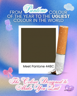
From Pantone’s Colour of the Year to the Ugliest Colour in the World
From Pantone’s Colour of the Year to the Ugliest Colour in the World
Every December, designers, trend forecasters and brand strategists hold their collective breath waiting for one announcement: the Pantone Colour of the Year.
It’s a tradition that shapes fashion collections, marketing palettes and Instagram feeds for months. The colour isn’t just a shade, it’s a statement about mood, emotion, and culture.
Pantone calls it “a snapshot of what we see taking place in our global culture.”
But while we celebrate colour as art and emotion, there’s another, far darker side to colour psychology, one that’s used not to attract, but to repel.
Colour That Inspires — and Colour That Discourages
Each year, Pantone tells us what’s in.
From Viva Magenta to Classic Blue and Peach Fuzz, these shades are chosen for how they make us feel: hopeful, energetic, calm, connected.
But what about colours chosen specifically to make us feel the opposite, disgust, discomfort, even shame?
That’s where the infamous “world’s ugliest colour” comes in.
Meet Pantone 448C: The Colour Designed to Make You Quit
Back in 2012, the Australian government commissioned a study to find a colour that would make cigarette packaging as unattractive as possible. After testing dozens of shades with focus groups, they found a clear winner, or rather, loser.
Pantone 448C, a murky brown-green-grey, was officially declared the world’s ugliest colour.
Psychologists described it as “dirty”, “deathly”, and “tar-like”. Focus groups associated it with decay, filth, and sickness.
It was so repulsive that it became the standard colour for plain cigarette packaging, deliberately chosen to make smoking feel less glamorous and more grim.
And it worked.
Australia saw a noticeable decline in smoking rates after the packaging change, and several countries, including the UK, France and New Zealand, followed suit.
A single colour had changed behaviour.
The Psychology Behind the Palette
We often think of colour as aesthetic — a creative choice. But colour is psychological before it’s visual. It speaks to our instincts.
- Warm colours (reds, oranges) evoke passion, energy and appetite.
- Cool tones (blues, greens) feel calm, clean, trustworthy.
- Muted tones — especially browns and greys — can feel lifeless or institutional.
That’s why Pantone 448C was so effective: it stripped away the allure. It took something once designed to feel sleek and desirable, and rebranded it as something repulsive.
It’s a clever inversion of what brands normally do — colour not to attract, but to discourage.
Colour as Communication
The contrast between Pantone’s joyful Colour of the Year campaigns and the government’s anti-smoking palette highlights something fascinating: colour can carry meaning without words.
Pantone uses colour to express emotion, to unify global design under shared optimism.
Governments use colour to influence public behaviour and perception.
Both rely on the same truth, colour speaks directly to the subconscious.
Designers already know this intuitively: a good colour choice can sell a product, shift a mood, or define a brand. But the “ugliest colour in the world” reminds us that design can also serve a social purpose, that sometimes, beauty isn’t the goal.
Beauty, Behaviour, and Branding
There’s a poetic irony in how colour theory bridges design and psychology.
While brands chase Pantone trends to appear relevant or aspirational, governments use the very same science to save lives.
It shows that colour isn’t neutral; it carries cultural, emotional, and even ethical weight.
What’s “beautiful” in one context might be “disgusting” in another, depending entirely on what we’re trying to achieve.
Maybe that’s the real lesson behind Pantone’s yearly ritual: it’s not just about the colour we celebrate, but how we understand the power of colour itself.
From inspiring art to discouraging addiction, colour design sits quietly at the crossroads of creativity and psychology — shaping how we feel, and sometimes, how we behave.

Nature's Influence in the Man-Made World of Design: The Kingfisher-Inspired Bullet Train
Introduction: In the world of design, inspiration can be found in unexpected places. Nature, with its intricate patterns, efficient mechanisms, and breathtaking aesthetics, has long served as a wellspring of creativity for human innovation. From architecture to transportation, the principles of nature have guided designers to create efficient, sustainable, and visually appealing solutions. In this blog post, we explore the remarkable synergy between nature and the man-made world of design, with a particular focus on the kingfisher bird and its influence on the creation of a groundbreaking transportation marvel – the bullet train.
- Nature’s Efficiency and Adaptability: One of the most striking features of nature is its ability to adapt and evolve, constantly refining designs to maximize efficiency. Designers have often turned to nature’s optimized structures to improve their creations. The kingfisher bird, renowned for its swift and precise hunting technique, played a significant role in the development of high-speed train technology.
- The Kingfisher’s Influence on the Bullet Train: The iconic Shinkansen, commonly known as the bullet train, exemplifies nature-inspired design. Engineers sought to reduce the loud noise produced by the train when entering and exiting tunnels, as it created disturbances for nearby residents and wildlife. To tackle this challenge, they turned to the kingfisher bird for inspiration.
- Form Meets Function: The streamlined body and beak shape of the kingfisher served as the basis for the bullet train’s design. Just like the bird, the train needed a sleek and aerodynamic form to minimize noise and increase efficiency. By imitating the kingfisher’s beak, which seamlessly pierces the water’s surface with minimal splashing, engineers were able to reduce the train’s sonic boom when passing through tunnels. This design modification significantly diminished noise pollution and enhanced the overall experience for passengers and residents along the train’s route.
- Efficiency and Speed: The kingfisher’s unique aerodynamic design not only influenced noise reduction but also improved the train’s speed and energy efficiency. The streamlined shape reduces air resistance, enabling the train to glide smoothly through the air with minimal energy loss. As a result, the bullet train can achieve remarkable speeds while consuming less power compared to conventional trains. Nature’s wisdom provided designers with an optimal solution, demonstrating how efficiency and sustainability can be achieved by observing and imitating natural forms.
- Embracing Sustainability: Another crucial aspect of the kingfisher-inspired bullet train is its alignment with sustainable practices. Nature’s time-tested strategies have inherently incorporated efficiency and eco-friendliness. By integrating elements inspired by the kingfisher, the train promotes reduced energy consumption and decreased environmental impact, contributing to a greener and more sustainable transportation system.
Conclusion: Nature has always been a masterful designer, providing humanity with inspiration and innovative solutions. The kingfisher-inspired bullet train showcases how the brilliance of nature can revolutionize the man-made world of design. By imitating the bird’s streamlined shape, engineers were able to create a faster, quieter, and more sustainable mode of transportation. This remarkable synergy between nature and design reminds us of the importance of observing and learning from the natural world to shape a more harmonious and efficient future.
As we continue to navigate the challenges of design and engineering, let us not forget the wealth of knowledge and inspiration that nature offers. By embracing nature’s wisdom, we can create a world that seamlessly blends human ingenuity with the beauty and efficiency found in the natural realm.

Problem-Solving as a Designer: Unleashing Creative Solutions
Introduction: As a designer, problem-solving is at the core of our work. We are constantly faced with challenges and obstacles that require us to think critically and come up with innovative solutions. In this blog post, we will explore the mindset, methodologies, and techniques that can help designers effectively solve problems and create impactful designs.
- Embrace a User-Centered Approach: A key aspect of problem-solving as a designer is understanding the needs, preferences, and pain points of the end-users. By empathising with the target audience, you can gain valuable insights that guide your design decisions. Conduct user research, create personas, and engage in user testing to gather data and validate your assumptions. This user-centered approach ensures that your solutions align with the intended users’ requirements.
- Define the Problem: Before diving into solutions, it is essential to clearly define and understand the problem at hand. Ask yourself questions like: What are the underlying causes? What are the constraints? What are the desired outcomes? By breaking down the problem into its components, you can identify the root issues and set specific goals for your design process.
- Ideation and Brainstorming: Once the problem is well-defined, it’s time to generate ideas. Engage in brainstorming sessions, either individually or collaboratively, to explore a wide range of potential solutions. Encourage wild ideas and avoid judgment at this stage. Remember, creativity thrives when boundaries are relaxed, and unconventional ideas can lead to groundbreaking designs.
- Research and Explore: To develop effective solutions, it’s crucial to have a deep understanding of the context surrounding the problem. Conduct thorough research to gather information about industry trends, competitor analysis, technological advancements, and design best practices. By staying informed, you can uncover inspiration, identify gaps in existing solutions, and leverage relevant insights to inform your design choices.
- Iterative Prototyping: Design is an iterative process, and prototyping plays a vital role in refining and validating ideas. Create low-fidelity prototypes early in the design process to quickly test and iterate on concepts. Solicit feedback from users, stakeholders, and peers to gain different perspectives and refine your designs based on real-world insights. Gradually progress to higher fidelity prototypes as you iterate and refine your solutions.
- Collaborate and Seek Feedback: Design problem-solving is rarely a solitary endeavor. Collaborate with multidisciplinary teams, including developers, marketers, and product managers, to gain diverse perspectives. Sharing ideas and receiving feedback can lead to innovative breakthroughs. Actively seek feedback from users and stakeholders throughout the design process to ensure that your solutions meet their expectations.
- Test and Validate: Before implementing your design, conduct usability testing and gather user feedback. Test your prototypes with representative users to identify potential usability issues, gather insights, and validate your design decisions. User testing provides valuable data that can help you refine and optimize your solutions, ensuring they are user-friendly, intuitive, and effective.
- Iterate and Refine: Design problem-solving is an ongoing process. Continuously iterate, refine, and improve your solutions based on feedback, data, and evolving user needs. Embrace the mindset of continuous improvement, and be open to revisiting and refining your designs even after they are implemented.
Conclusion: As a designer, problem-solving is an integral part of your role. By adopting a user-centered approach, defining the problem, ideating, researching, prototyping, collaborating, and testing, you can navigate challenges and create impactful designs. Remember, effective problem-solving requires an open mind, persistence, and a willingness to learn from both successes and failures. Embrace the iterative nature of the design process, and never underestimate the power of creativity in finding innovative solutions

Unveiling the Controversial Past: Futura, the Font Designed by Nazis
Introduction:
Typography plays a crucial role in shaping our visual communication. From advertising to branding, the choice of fonts can convey specific messages and evoke certain emotions. One such typeface, Futura, has gained worldwide recognition for its modern and sleek design. However, behind its aesthetic appeal lies a dark and controversial history. In this blog, we delve into the origins of Futura and its association with the Nazi regime during World War II.
The Birth of Futura:
Futura was created in the late 1920s by renowned German graphic designer Paul Renner. Renner envisioned a font that encapsulated the spirit of the machine age, characterised by geometric shapes, clean lines, and simplicity. Futura quickly gained popularity in Germany and abroad for its innovative design and modernist approach, making it a hallmark of the Bauhaus movement.
The Nazi Connection:
During the early 1930s, Adolf Hitler and the Nazi Party rose to power in Germany. Hitler’s regime sought to establish a new national identity, which included a distinctive visual language. The Nazis viewed Futura as a symbol of modernity and progress, aligning with their vision of a technologically advanced and efficient Germany.
In 1933, the Nazis initiated a purge of “degenerate art” and banned many artistic movements, including the Bauhaus. However, Futura managed to escape this fate due to its association with the party. Renner, the font’s designer, was a member of the German Communist Party and had been critical of the Nazis. Nonetheless, the party recognised the value of Futura in their propaganda campaigns and decided to overlook Renner’s political leanings.
Nazi Propaganda and Futura:
Futura became the official typeface of the Nazi Party, featuring prominently in their propaganda materials, including posters, banners, and publications. The font’s geometric shapes and clean lines aligned with the party’s preference for minimalist design and strict visual standards.
Futura’s use in Nazi propaganda not only helped establish a consistent visual identity but also aimed to convey an image of strength, efficiency, and modernity. The font’s association with the Nazi regime during this period forever linked it to a dark chapter in history.
Post-War Perception and Legacy:
After World War II, the world became aware of the atrocities committed by the Nazis, and Futura’s association with the party tarnished its reputation. The font’s usage declined significantly as a result of its connection to a regime responsible for immense suffering and destruction.
However, it is crucial to note that Futura’s original intention was never rooted in Nazi ideology. Its design was an expression of the artistic and technological progress of the time, and it served as a significant contribution to the field of typography. Today, Futura continues to be a popular typeface, widely used in various contexts.
Conclusion:
Futura, the font designed by Paul Renner, has a complex and controversial history. Its association with the Nazi regime during World War II has forever linked it to a dark period in human history. While Futura’s usage declined following the war, it is important to acknowledge the font’s original intent and recognise that its design transcends its association with the Nazis. As we examine the historical context of typefaces, we gain a deeper understanding of how our visual communication is intertwined with the events and ideologies of the past.

The Bauhaus Influence: How LEGO's Color Scheme Reflects the Modernist Movement
Introduction:
The Bauhaus movement, which emerged in the early 20th century, revolutionised the world of design, architecture, and art. Its principles of simplicity, functionality, and the elimination of unnecessary ornamentation had a profound impact on various creative disciplines. One unexpected area where the influence of Bauhaus can be seen is in the colour scheme of LEGO, the iconic toy brand that has captured the imaginations of millions of children and adults worldwide. In this blog post, we will explore how Bauhaus inspired LEGO’s colour choices, resulting in a visually appealing and harmonious palette.
The Bauhaus Aesthetic:
The Bauhaus movement, founded in 1919 by Walter Gropius, aimed to unite art and industry. It emphasised the marriage of form and function, promoting the idea that design should serve a purpose while being visually pleasing. This philosophy also extended to the use of colour, where the focus was on simplicity, clarity, and the psychological effects of hues. The Bauhaus artists and designers believed that colours could evoke emotions and create harmony when used in a balanced and deliberate manner.
LEGO’s Color Palette:
LEGO, the Danish company known for its interlocking plastic bricks, has embraced the principles of Bauhaus in various aspects of its design, including its colour choices. LEGO’s colour palette primarily consists of bright, bold hues that catch the eye and evoke a sense of playfulness and creativity. The colours used in LEGO sets are carefully selected to enhance the building experience, stimulate imagination, and create visually appealing designs.
Primary Colours:
One of the fundamental principles of Bauhaus was the use of primary colours, and LEGO’s colour palette reflects this idea. Red, blue, and yellow, the three primary colours, are prominently featured in LEGO sets. These vibrant hues not only allow for endless creative combinations but also represent the essential building blocks of colour theory itself.
Simplicity and Contrast:
Bauhaus emphasised the use of strong contrasts to create visual impact and legibility. LEGO incorporates this principle by using contrasting colours in its designs. Black, white, and gray elements are often employed to provide a neutral backdrop and highlight the primary colours. The juxtaposition of light and dark tones adds depth and visual interest to LEGO creations, while maintaining a clean and minimalist aesthetic.
Color Psychology:
Bauhaus placed great importance on the psychological impact of colours. Similarly, LEGO understands the power of colours in evoking specific emotions and experiences. Warm colours like red and orange can symbolise energy and excitement, while cool colours like blue and green can represent calmness and tranquility. By incorporating a range of colours, LEGO encourages users to explore different moods and narratives within their creations.
Versatility and Accessibility:
The Bauhaus movement aimed to make design accessible to all, and LEGO shares a similar vision. LEGO’s colour palette is intentionally designed to be versatile, allowing builders of all ages and backgrounds to create their own unique designs. The simplicity and limited number of colours make it easier to mix and match pieces, fostering creativity and open-ended play.
Conclusion:
The influence of the Bauhaus movement can be observed in numerous artistic and design realms, and LEGO’s colour scheme is a prime example. Through the use of primary colours, simplicity, contrast, and a deep understanding of colour psychology, LEGO creates a visually captivating and versatile palette that inspires builders of all ages. The marriage of Bauhaus principles and the playful nature of LEGO results in a harmonious colour scheme that continues to spark imagination and creativity in millions of people worldwide.

Understanding Bauhaus: The Modernist Movement that Shaped Design
Introduction:
Bauhaus, a revolutionary school of design, art, and architecture, emerged in Germany in the early 20th century. It became one of the most influential movements in modern design history, leaving an indelible mark on various creative disciplines. In this blog post, we will delve into the world of Bauhaus, exploring its origins, key principles, notable figures, and enduring legacy.
Origins of Bauhaus:
The Bauhaus school was founded in 1919 in Weimar, Germany, by architect Walter Gropius. It aimed to bring together different artistic disciplines under one roof, erasing the boundaries between fine art, crafts, and industrial design. The name “Bauhaus” itself is derived from the German words “Bau” (building) and “Haus” (house), signifying the fusion of art and technology.
Key Principles:
- Unity of Art and Craft: Bauhaus sought to reunite artistic creativity with craftsmanship, recognising that the two were intertwined. The school emphasised the value of functional design and the marriage of form and function.
- Form Follows Function: This principle, often associated with the Bauhaus movement, emphasises that the design of an object should be primarily driven by its intended purpose and use. It rejects unnecessary ornamentation and embraces simplicity and utility.
- Experimentation with Materials and Techniques: Bauhaus encouraged students and artists to explore innovative materials and techniques to create functional and aesthetically pleasing designs. Experimentation with new industrial materials and mass production methods played a pivotal role in the movement.
- Minimalism and Simplicity: Bauhaus embraced minimalism in design, emphasising clean lines, geometric shapes, and simplicity. The focus was on reducing unnecessary elements and achieving visual harmony.
Notable Figures:
- Walter Gropius: As the founder of Bauhaus, Walter Gropius was instrumental in shaping its philosophy and direction. His visionary leadership brought together artists, architects, and designers to create a unique learning environment.
- Wassily Kandinsky: A renowned painter and teacher at Bauhaus, Kandinsky explored abstract art and colour theory. His work exemplified the fusion of art and design principles.
- Marcel Breuer: A talented architect and furniture designer, Breuer’s innovative use of tubular steel in furniture became an iconic hallmark of the Bauhaus movement.
Enduring Legacy:
Despite the Bauhaus school’s relatively short existence (it was forced to close in 1933 due to pressure from the Nazi regime), its impact has been profound and far-reaching. The core principles and aesthetics of Bauhaus design have influenced countless architects, designers, and artists worldwide.
Bauhaus-inspired designs can be seen in various aspects of our daily lives, from furniture and lighting to graphic design and typography. The movement’s emphasis on functionalism, minimalism, and experimentation has left an indelible mark on contemporary design.
Conclusion:
Bauhaus remains a seminal movement that revolutionised the way we think about design, art, and architecture. Its innovative approach, focus on functionality, and integration of art and technology continue to inspire creative minds today. By blending form and function, Bauhaus has provided a lasting legacy that continues to shape the world of design in the 21st century and beyond.

Exploring Art Movements: A Journey Through Creative Expressions
Title: Exploring Art Movements: A Journey Through Creative Expressions
Introduction:
Art has been an integral part of human civilisation, reflecting our thoughts, emotions, and the evolution of our society. Over the centuries, artists have banded together, forming collectives that share common ideas, techniques, and philosophies. These groups, known as art movements, have played a significant role in shaping the art world and have left a lasting impact on artistic expression. In this blog post, we will embark on a fascinating journey through some of the most influential art movements, unraveling their distinctive characteristics and exploring the artists who propelled them forward.
- Renaissance:
The Renaissance, a revolutionary period that emerged in the 14th century, witnessed a rebirth of classical ideas and a renewed interest in humanism. This movement celebrated the achievements of ancient civilisations, emphasising the importance of individualism, scientific inquiry, and artistic mastery. Artists like Leonardo da Vinci, Michelangelo, and Raphael emerged during this time, producing awe-inspiring works that still captivate us today.
- Impressionism:
In the late 19th century, a group of artists challenged the traditional notions of representation and sought to capture the fleeting impressions of light and colour. Impressionism, characterised by loose brushwork, vibrant palettes, and an emphasis on depicting everyday scenes, brought a fresh and innovative approach to art. Pioneers such as Claude Monet, Edgar Degas, and Pierre-Auguste Renoir captured the essence of a moment and the transient nature of life itself.
- Cubism:
Breaking away from the confines of traditional perspective and representation, Cubism emerged in the early 20th century as a radical departure from conventional art. Spearheaded by Pablo Picasso and Georges Braque, this movement deconstructed objects and reassembled them in abstract, fragmented forms. Cubist artworks presented multiple viewpoints simultaneously, challenging the viewer’s perception and inviting a deeper engagement with the subject matter.
- Surrealism:
Driven by the exploration of the subconscious mind and the power of dreams, Surrealism emerged in the early 20th century as a response to the chaos of World War I. Artists like Salvador Dalí, René Magritte, and Max Ernst sought to tap into the irrational and the unconscious, creating enigmatic and dreamlike compositions. Surrealism blurred the boundaries between reality and imagination, opening up new avenues for artistic expression and social critique.
- Abstract Expressionism:
Following the turmoil of World War II, Abstract Expressionism emerged as a powerful movement in American art. Artists such as Jackson Pollock, Mark Rothko, and Willem de Kooning used bold, gestural brushstrokes, vibrant colours, and non-representational forms to express their emotions and subconscious states. Abstract Expressionism celebrated the act of painting itself, emphasising the artist’s inner world and their relationship with the canvas.
- Pop Art:
In the 1950s, a group of artists turned to popular culture and consumerism as sources of inspiration, giving birth to Pop Art. Figures like Andy Warhol, Roy Lichtenstein, and Claes Oldenburg incorporated everyday objects, advertising imagery, and celebrity icons into their art. By elevating the mundane to the realm of fine art, Pop Art challenged the boundaries between high and low culture, while making bold statements about mass production and the commodification of art.
Conclusion:
In conclusion, art movements provide us with a rich tapestry of creative expression, a testament to the diverse perspectives and narratives that shape our world. They ignite conversations, challenge preconceived notions, and inspire us to explore the limitless possibilities of human imagination. By delving into the fascinating history of art movements, we gain a deeper appreciation for the power of art to shape and reflect our shared human experience. So let us continue to celebrate and engage with the ever-evolving world of art movements, for they are windows into the vibrant tapestry of human creativity.