
The End of an Era: MTV Goes Dark After 44 Years
After 44 years on air, MTV’s traditional broadcast channels have officially shut down, marking the end of one of the most influential cultural forces in modern media. For a generation (or three), MTV wasn’t just a TV channel — it was the place where music, fashion, youth culture and rebellion collided.
Its closure isn’t just about a channel switching off. It’s a symbol of how completely the media landscape has changed in the age of streaming.
When MTV Was the Culture
When MTV launched in 1981 with Video Killed the Radio Star, it fundamentally changed how we experienced music. Artists weren’t just heard — they were seen. Image became as important as sound.
MTV created:
- Music video culture
- Global pop icons
- Youth-driven trends in fashion, language and attitude
Shows like Total Request Live, MTV Cribs, Jackass, Pimp My Ride and The Osbournes defined entire eras. Even when the channel drifted away from pure music, it still dictated what felt current, controversial and cool.
MTV didn’t just reflect youth culture — it shaped it.
The Slow Shift Away from Music
Ironically, MTV’s decline began when it stopped being about music.
As the 2000s rolled in, reality TV replaced music videos. Cheaper to produce and easier to binge, these formats dominated airtime while music content quietly faded into late-night slots.
At the same time, the internet was rising.
YouTube launched in 2005 and made music videos instantly accessible, on-demand, and global. Audiences no longer needed a TV schedule to discover new artists — they could search, share and replay endlessly.
MTV lost its monopoly overnight.
Streaming Changed Everything
The shutdown of MTV’s broadcast channels is really a consequence of streaming culture Today:
- Music lives on Spotify, Apple Music and SoundCloud
- Videos live on YouTube, TikTok and Instagram
- Artists break through on social platforms, not TV
Discovery is algorithm-led, not presenter-led.
Trends are created by communities, not programming schedules.
The idea of waiting for your favourite video to appear on TV now feels completely foreign.
From Gatekeeper to Brand
MTV’s power once came from its role as a gatekeeper — deciding which artists got visibility. In the streaming era, that power dissolved.
Anyone can upload. Anyone can go viral. Anyone can build an audience without approval.
MTV adapted by becoming more of a brand than a broadcaster — expanding into awards shows, online content, and licensing. But the traditional channel model couldn’t survive in a world where viewers expect instant access, personalisation and choice.
Why This Feels So Emotional
For many people, MTV represents a shared experience that streaming can’t replicate.
Everyone watched the same things at the same time.
You talked about last night’s show at school the next day.
Music videos felt like events.
Streaming is efficient, but it’s also isolating. We all live in our own curated feeds now, rarely sharing the same cultural moments.
MTV’s shutdown marks the loss of that collective rhythm.
What Comes Next
MTV as a concept isn’t gone — it’s just scattered.
Its spirit lives on in:
- TikTok trends
- YouTube creators
- Livestreams
- Viral music moments
But the era of linear broadcasting — of sitting in front of a TV and letting culture come to you — is officially over.
The future belongs to platforms that move faster, adapt quicker, and speak directly to niche audiences rather than one massive one.
Final Thoughts
The end of MTV’s broadcast channels isn’t just about nostalgia — it’s a reminder of how fast culture evolves.
MTV changed the world.
Streaming changed MTV.
And while the channel may have gone dark, its influence is everywhere — in how we consume music, how artists present themselves, and how youth culture continues to reinvent itself online.
After 44 years, MTV didn’t just sign off — it passed the mic.

The Death of GeoCities — and the Website Preserving the Internet’s Lost Soul
The Death of GeoCities — and the Website Preserving the Internet’s Lost Soul
Before social media feeds, algorithms, and perfectly aligned templates, the internet was messy. Loud. Personal.
And for millions of people, it lived on GeoCities.
Launched in the mid-1990s, GeoCities gave everyday users the power to build their own corner of the web — no rules, no brand guidelines, no aesthetic filters. Just blinking text, tiled backgrounds, pixel art, MIDI music, visitor counters and unfiltered personality.
When GeoCities shut down in 2009, a huge part of internet history vanished with it.
Or so we thought.
What GeoCities Really Was
GeoCities wasn’t just a website builder — it was an early social internet.
Users created pages about their hobbies, fan theories, pets, diaries, poetry, conspiracies, and obsessions. Sites were organised into “neighbourhoods” like Hollywood, SiliconValley, or Area51, giving people a sense of belonging long before platforms formalised it.
It was chaotic, amateur, and deeply human.
No engagement metrics.
No optimisation.
No influencers.
Just people making things because they wanted to.
When the Internet Decided to Grow Up
As the web evolved, design became cleaner, faster, more corporate.
Templates replaced experimentation. Platforms replaced personal sites. Personality gave way to polish.
When Yahoo! shut GeoCities down, it wasn’t just a technical decision — it marked a cultural shift. The internet moved from self-expression to self-presentation.
The weird bits didn’t fit anymore.
Enter Cameron’s World
That’s where Cameron’s World comes in.
Created by artist and developer Cameron Askin, Cameron’s World is a lovingly chaotic archive of GeoCities-era web design — rebuilt from thousands of salvaged pages. It doesn’t just document old websites; it recreates the experience of using the internet back then.
Scrolling through it feels like stepping into a time capsule:
- Animated GIFs everywhere
- Comic Sans, Times New Roman, WordArt chaos
- Broken layouts
- MIDI music autoplaying without consent
- Passion projects with zero self-awareness
It’s overwhelming. And that’s the point.
Why This Preservation Matters
Cameron’s World isn’t just nostalgia bait — it’s digital preservation.
Early internet culture is often dismissed as “cringe” or “ugly”, but it represents a time when creativity wasn’t monetised, curated or optimised. It shows what happens when people are given tools without being told how to use them “properly”.
In a world where most online spaces now look the same, GeoCities reminds us that the internet used to be:
- Personal instead of performative
- Expressive instead of branded
- Weird instead of safe
Preserving that matters — not just for memory, but for inspiration.
The Comfort of Digital Mess
There’s something strangely comforting about GeoCities-style chaos.
It feels honest. Imperfect. Unfiltered.
In contrast to today’s algorithm-led feeds, these sites weren’t designed to be liked, shared, or sold. They were designed to exist.
Cameron’s World lets us remember a time when the internet wasn’t trying to impress anyone — it was just trying to connect.
What We’ve Lost — and What We Can Learn
The death of GeoCities symbolises more than a platform shutting down. It represents the loss of ownership.
Today, our content lives on platforms we don’t control, subject to moderation changes, monetisation rules, and sudden shutdowns.
GeoCities gave people a home.
Cameron’s World gives us a reminder of what that felt like.
Maybe the future of the internet doesn’t need to look like the past — but it could learn from it. A little more mess. A little more freedom. A little less polish.
Final Thoughts
Cameron’s World isn’t just a tribute — it’s a quiet protest against how sanitised the internet has become. It celebrates creativity without permission, design without rules, and identity without optimisation.
GeoCities may be dead, but its spirit isn’t.
It’s blinking.
It’s loud.
And it’s still beautifully, unapologetically human.

Whatever Happened to Tween Content?
Whatever Happened to Tween Content?
Once upon a time, tweens had their own universe.
There were Nickelodeon and Disney Channel stars — the IT boys and girls of the 2000s and early 2010s — who shaped everything from fashion to friendships. They were cool, but still relatable. Young enough to feel like your mate, yet old enough to look up to.
Fast forward to today, and that world has quietly vanished. The era of Hannah Montana, iCarly, and Victorious has been replaced by TikTok, YouTube and Instagram — platforms with no real “in-between” stage for growing up online.
And that raises a serious question: what happens to a generation with no dedicated space to just be tweens anymore?
From Tween Idols to Influencers
Disney Channel once served as a cultural middle ground — glossy but safe, aspirational but age-appropriate. Shows had morals (albeit cheesy ones), storylines about friendship, and characters who made mistakes without facing internet-sized consequences.
Now, that content gap has been filled by social media influencers — adults who are often selling lifestyles, products, and beauty standards rather than relatable experiences.
Instead of looking up to Selena Gomez in Wizards of Waverly Place, tweens are scrolling past twenty-somethings with full glam routines, curated aesthetics, and sponsorship deals. The line between inspiration and imitation has blurred, leaving many tweens trying to grow up too fast.
No Safe Space to Grow
Tween-focused TV used to act as a kind of buffer — a space where young audiences could experiment with identity, fashion, and friendship before stepping into the harsher realities of adolescence.
But TikTok, Instagram and YouTube collapse all those stages together. Ten-year-olds share digital spaces with adults. The content they consume — makeup tutorials, “Get Ready With Me” videos, and lifestyle vlogs — isn’t necessarily for them, but it’s what they see the most.
Without age-targeted media, the natural curiosity of tweens is being funnelled through platforms designed for engagement, not wellbeing. The result? Kids trying to look, act, and post like adults before they’ve had the chance to just be kids.
When Childhood Becomes Content
Tweens are incredibly impressionable, and the influencer world knows that.
From viral “clean girl” aesthetics to daily skincare routines featuring £50 serums, the messaging is subtle but powerful: appearance equals value.
It’s easy to see how that pressure builds.
Social media rewards visibility — the prettier, the older, the more polished you look, the more likes you get. The performance of adulthood has become a kind of social currency, even for those who haven’t reached their teens.
And while most influencers don’t set out to harm, the ecosystem itself doesn’t differentiate between a 12-year-old viewer and a 25-year-old one. It’s all just data, clicks, and conversions.
This creates a perfect storm — one where boundaries blur, algorithms overexpose, and predators inevitably take notice. (And yes, that’s a conversation that deserves more than a footnote, even if we only touch on it lightly here.)
The Cultural Consequences
Without a middle layer of media — that tween space where content is aspirational yet innocent — we’re losing an important stage of development. The jump from Bluey to TikTok is too big.
There’s no more gentle transition, no more silly sitcoms about school crushes or friendship dramas that end in a group hug. Instead, tweens are consuming content made for adults and trying to replicate it — from fashion trends to language to online personas.
It’s not about being prudish or nostalgic for the past; it’s about balance.
When every screen is a mirror reflecting adult ideals, how can children learn who they are outside of those influences?
Reimagining Tween Media for a Digital World
Maybe it’s time we rethink what tween content looks like in 2025.
The platforms have changed, but the need hasn’t. Tweens still want role models, stories, and spaces that speak to their stage of life — not ones that rush them through it.
Creators, brands, and media companies have an opportunity to build those spaces again — to make content that celebrates awkwardness, curiosity, creativity, and joy without pushing kids into premature adulthood.
Because right now, tweens aren’t growing up with Disney Channel.
They’re growing up with TikTok — and that’s a completely different kind of storytelling.
The question isn’t just “what happened to tween content?”
It’s whether we’re willing to rebuild it — before a whole generation forgets what it’s like to just be a kid.

The “African” Font That Isn’t African at All
The “African” Font That Isn’t African at All
You’ve seen it before — bold, jagged lettering used on movie posters, safari tours, charity campaigns, and restaurant signs. The so-called “African” font: earthy tones, tribal patterns, uneven strokes. It’s meant to evoke the continent’s “vibe” — wild, raw, authentic.
But here’s the catch: most of those fonts weren’t designed in Africa at all.
They were designed in America, by designers who’ve often never set foot on the continent.
And that simple fact says a lot about how Western media continues to shape — and stereotype — African identity through design.
When Aesthetic Becomes Assumption
The “African-style” font as we know it didn’t emerge from African typographic traditions. It emerged from Hollywood.
Think of posters for films like The Lion King, Out of Africa, or Madagascar. Each one uses typefaces that share a certain look — irregular strokes, uneven letterforms, and earthy, ochre tones. The design shorthand says “Africa”, but what it’s really saying is “a Western fantasy of Africa”.
These fonts are often bundled on stock websites or in font libraries under names like Safari, Tribal, or Zebrawood. They’re built to communicate exoticism, wilderness, or adventure — not the diverse, contemporary realities of 54 different countries.
In short, they’re not cultural representation. They’re branding.
The Problem With Design Shortcuts
Typography is storytelling. It carries history, emotion, and identity — whether you realise it or not.
So when a single “African” font becomes the go-to design choice for anything related to the entire continent, it flattens centuries of culture into a cartoon aesthetic. It tells audiences that Africa is one monolithic “vibe”, not a tapestry of languages, scripts, and design traditions.
Even worse, it continues the colonial-era habit of defining Africa through an outsider’s lens — one that’s exotic, primitive, or untamed.
The irony? While American studios were designing these “tribal” fonts, African designers were already creating contemporary typefaces inspired by Akan symbols, Amharic script, Nsibidi, Ge’ez, N’Ko, and Arabic calligraphy — fonts that rarely make it into Western media kits or corporate brand decks.
Designing Without Context
To be clear, the issue isn’t just about who designs a font — it’s how it’s used.
A font inspired by traditional patterns or shapes isn’t inherently offensive. But when it’s applied carelessly — slapped onto film titles, travel brochures, or charity posters — it becomes a shorthand for “otherness”.
It’s the design equivalent of using a drumbeat to signal “Africa” in a movie soundtrack.
It’s lazy, outdated, and reductive.
Good design requires context. It requires understanding. And if a font is being used to “represent Africa”, that understanding should come from African designers, artists, and typographers themselves.
Reclaiming the Narrative
The good news is that this is already changing.
Across Africa, designers are reclaiming their visual identities — not through imitation of Western styles, but by drawing from their own heritage in new, innovative ways.
Studios in Lagos, Nairobi, Cape Town and Accra are creating fonts rooted in local languages and aesthetics. Projects like African Typeface Design and TypeFoundry ZA are reshaping what African design looks like in the global space.
It’s design by Africans, for everyone — not design by Americans, for Western expectations of what “Africa” should feel like.
Why It Matters
Fonts aren’t neutral. They communicate ideas long before you read the words they spell out.
When the same visual clichés are used again and again, they reinforce the same narrow story — one where Africa is exotic, undeveloped, or “wild”.
Designers hold power in shaping perception. And that means questioning where our fonts, colour palettes and “themes” really come from — and whose story they tell.
Because cultural appreciation and cultural appropriation often look the same on the surface — it’s the intention and understanding beneath that makes all the difference.
So next time you see a “tribal” font used to represent Africa, ask yourself — is this really African design, or just another American interpretation of it?

A Font Born from Misunderstanding
A Font Born from Misunderstanding
The origins of the stereotypical “Chinese-looking” font go back to the early 20th century, when Western printers began designing typefaces that would “look Oriental” to Western audiences.
They used brushstroke-like strokes, squared-off serifs, and sharp corners meant to mimic Chinese calligraphy — but only visually, not linguistically. These fonts had nothing to do with real Chinese type design or traditional writing systems.
Fonts like “Wonton,” “Chop Suey,” and “Chinese Takeaway” (yes, those are real names) were created in the United States, designed by white typographers who wanted to evoke “exoticism” and “mystery.”
It wasn’t about communication — it was about aesthetic stereotype.
Typography as Costume
In Hollywood’s Golden Age, these fonts became shorthand for anything vaguely “Asian.”
Movie posters, restaurant signs, and even TV shows used them as visual cues: the letters themselves were a costume — a quick way to say “this is Chinese” without needing to understand the culture.
You didn’t need to read Chinese to “get it.” The font did the talking.
But here’s the problem: it wasn’t speaking Chinese — it was speaking American fantasy.
Designing Identity from the Outside In
Just like the so-called “African” fonts designed in the West, these “Chop Suey” typefaces compress an entire civilisation into a single visual trope.
They take the complex beauty of Chinese calligraphy — one of the world’s oldest and most revered art forms — and flatten it into a gimmick: angular, symmetrical, and conveniently “foreign.”
It’s the visual equivalent of using a gong sound in a movie whenever a Chinese character appears.
Instant recognition, zero understanding.
How It Persists Today
You might think we’ve outgrown this — but take a walk through any Western city’s “Chinatown,” or glance at the branding of an “Asian-fusion” restaurant, and you’ll still see it: that same stereotypical typeface, often paired with red and gold colouring.
It’s not always malicious, but it is lazy.
Designers reach for these fonts because they’ve been coded into visual culture for decades. They signal “Chinese” to Western audiences, even if they’re historically and culturally inaccurate.
Meanwhile, real Chinese typography has evolved with incredible sophistication — from elegant Songti typefaces to experimental Simplified Chinese Sans-serifs used in tech and fashion. Yet these authentic designs rarely make it into Western branding.
The Bigger Issue: Who Designs for Whom
This isn’t just about one typeface — it’s about power and perspective in design.
For centuries, Western media has been in the habit of defining other cultures visually — reducing entire identities into symbols that feel familiar to them.
When design is created about a culture rather than from within it, it tends to tell one story: the outsider’s.
And when those same visual clichés are used over and over, they stop being “design language” and start being stereotype.
Reclaiming Authentic Typography
Thankfully, there’s a growing movement of Chinese and East Asian designers pushing back.
Independent studios in Beijing, Shanghai, Taipei and Hong Kong are creating new typefaces that blend modern design with traditional calligraphy — fonts that reflect real cultural aesthetics, not caricatures of them.
Projects like Pangram Pangram’s collaborations with Chinese typographers and TypeLand China’s work on contemporary Chinese scripts are proving that global design doesn’t need to rely on outdated tropes to feel recognisable.
The future of typography is inclusive — and that means letting cultures design themselves.
Design Is Language — So Let’s Use It Responsibly
Fonts are more than decoration; they’re communication.
When a font pretends to represent an entire culture but is rooted in stereotype, it doesn’t just misinform — it diminishes.
It’s time designers ask tougher questions:
Who made this? Who is it for? And what story does it tell?
Because if the “Chinese” font was born in America, maybe it’s time we stop calling it Chinese — and start calling it what it really is: a Western fantasy of the East.
Typography tells stories. Let’s make sure they’re the right ones.
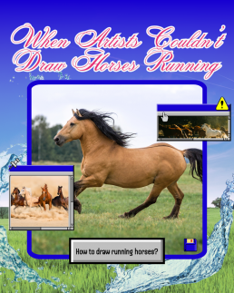
When Artists Couldn’t Draw Horses Running
When Artists Couldn’t Draw Horses Running
When Artists Couldn’t Draw Horses Running
Before photography galloped into the picture, even the greatest artists were getting one thing consistently and hilariously wrong:
How horses run.
For centuries, painters and sculptors depicted galloping horses with their legs stretched out like leaping greyhounds, front legs forward, back legs extended behind, suspended in mid-air, frozen in a majestic, yet physically impossible stride.
It looked powerful. It looked elegant. It looked completely wrong.
Before the Lens, There Was Guesswork
Before cameras, artists had only one tool for capturing motion: observation.
But the human eye and brain can’t process movement that fast. Horses gallop at such speed that, without photographic reference, it’s impossible to see the exact positioning of their legs.
So, for centuries, artists simply guessed.
They used logic and aesthetics instead of science. If a horse runs fast, surely its legs must stretch far apart, right?
It was a natural assumption, until technology proved otherwise.
Enter Eadweard Muybridge: The Man Who Froze Motion
In the 1870s, a man named Eadweard Muybridge, a British photographer working in the United States, was hired to solve a hotly debated question:
When a horse gallops, are all four hooves ever off the ground at once?
To find out, Muybridge set up a line of cameras triggered by tripwires along a racetrack.
The resulting series of photographs, captured in rapid succession, revealed something no one had ever seen before.
Yes, all four hooves do leave the ground, but not when the legs are stretched out.
Instead, it happens when the legs are tucked under the body, mid-stride, the complete opposite of what centuries of art had shown.
It was a revelation.
And it changed the way people understood movement forever.
When Art Meets Evidence
Muybridge’s photos didn’t just correct an artistic mistake, they shifted how humans thought about seeing, truth, and representation.
For the first time, artists and scientists had proof that the eye could deceive.
Movement, once fluid and mysterious, could now be dissected frame by frame.
Painters, sculptors and animators began to study these sequences, leading to more realistic depictions of not just horses, but all living motion.
You can see Muybridge’s influence ripple through everything from classical painting to early animation to the biomechanics used in CGI today.
The Poetry of Imperfection
And yet, there’s something charming about those pre-photography depictions.
They remind us that art isn’t just about accuracy, it’s about interpretation.
When artists painted horses before photography, they weren’t trying to lie. They were capturing the feeling of speed, power, and grace, the essence of motion, rather than its exact mechanics.
In a way, those elongated, impossible strides were more about emotion than anatomy.
They show how art has always been a collaboration between imagination and perception, a dialogue between what we think we see and what we feel to be true.
Technology and Truth
The horse paintings of the pre-photography era tell a larger story about technology’s role in art.
Every new tool, from the camera to AI, reshapes how we define creativity.
When photography arrived, artists didn’t become obsolete. They adapted. Impressionists like Degas and Monet began using photographic reference and motion studies to create new forms of realism — emotional, fleeting, human.
In the same way, today’s artists are learning to coexist with digital tools and AI, finding new ways to express timeless questions:
What’s real? What’s beautiful? What’s worth capturing?
A Gallop Through Time
So next time you see an old painting of a horse sprinting with legs stretched out like a cartoon, smile. It’s not a mistake. It’s a snapshot of a world before cameras, before slow motion, before science could catch up with imagination.
It’s proof that art has always been about more than getting it right.
It’s about trying to see, and sometimes, the trying itself is what makes it beautiful.
Because long before photography showed us the truth, art taught us to look for it.

Unveiling the Controversial Past: Futura, the Font Designed by Nazis
Introduction:
Typography plays a crucial role in shaping our visual communication. From advertising to branding, the choice of fonts can convey specific messages and evoke certain emotions. One such typeface, Futura, has gained worldwide recognition for its modern and sleek design. However, behind its aesthetic appeal lies a dark and controversial history. In this blog, we delve into the origins of Futura and its association with the Nazi regime during World War II.
The Birth of Futura:
Futura was created in the late 1920s by renowned German graphic designer Paul Renner. Renner envisioned a font that encapsulated the spirit of the machine age, characterised by geometric shapes, clean lines, and simplicity. Futura quickly gained popularity in Germany and abroad for its innovative design and modernist approach, making it a hallmark of the Bauhaus movement.
The Nazi Connection:
During the early 1930s, Adolf Hitler and the Nazi Party rose to power in Germany. Hitler’s regime sought to establish a new national identity, which included a distinctive visual language. The Nazis viewed Futura as a symbol of modernity and progress, aligning with their vision of a technologically advanced and efficient Germany.
In 1933, the Nazis initiated a purge of “degenerate art” and banned many artistic movements, including the Bauhaus. However, Futura managed to escape this fate due to its association with the party. Renner, the font’s designer, was a member of the German Communist Party and had been critical of the Nazis. Nonetheless, the party recognised the value of Futura in their propaganda campaigns and decided to overlook Renner’s political leanings.
Nazi Propaganda and Futura:
Futura became the official typeface of the Nazi Party, featuring prominently in their propaganda materials, including posters, banners, and publications. The font’s geometric shapes and clean lines aligned with the party’s preference for minimalist design and strict visual standards.
Futura’s use in Nazi propaganda not only helped establish a consistent visual identity but also aimed to convey an image of strength, efficiency, and modernity. The font’s association with the Nazi regime during this period forever linked it to a dark chapter in history.
Post-War Perception and Legacy:
After World War II, the world became aware of the atrocities committed by the Nazis, and Futura’s association with the party tarnished its reputation. The font’s usage declined significantly as a result of its connection to a regime responsible for immense suffering and destruction.
However, it is crucial to note that Futura’s original intention was never rooted in Nazi ideology. Its design was an expression of the artistic and technological progress of the time, and it served as a significant contribution to the field of typography. Today, Futura continues to be a popular typeface, widely used in various contexts.
Conclusion:
Futura, the font designed by Paul Renner, has a complex and controversial history. Its association with the Nazi regime during World War II has forever linked it to a dark period in human history. While Futura’s usage declined following the war, it is important to acknowledge the font’s original intent and recognise that its design transcends its association with the Nazis. As we examine the historical context of typefaces, we gain a deeper understanding of how our visual communication is intertwined with the events and ideologies of the past.