
When Deodorant Burns and Brands Must Speak Up
When Deodorant Burns and Brands Must Speak Up
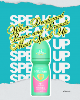
It’s rarely glamorous when a trusted product turns problematic. For many of us, deodorant is simply a reliable daily ritual—spray or roll-on in the morning, worry less about odour or sweat for the day. So when reports emerged that Mitchum’s 48-hour roll-on antiperspirant was causing burning underarms, irritation, rashes and worse, it struck a nerve. People.com+2ITVX+2
What happened?
Mitchum issued an apology after a large number of consumers in the UK, Ireland and South Africa reported severe reactions—including red, blistering underarms, stinging, and what some described as “chemical burns”. People.com
The company’s response: the formula itself hadn’t changed, but a change in the manufacturing process of a raw material caused some batches to interact with skin differently. They’ve reverted to the original process and are withdrawing affected batches. ITVX+1
Brand impact: trust meets trauma
For a brand like Mitchum, once known for strong antiperspirant performance, this kind of incident does several things at once:
- Erosion of reliability: When a product you’ve used for years suddenly fails you—or worse, injures you—the implicit trust breaks.
- Emotional fallout: Some users reported pain, sleepless nights, even scarring. These aren’t mild product complaints, they’re health & wellbeing issues. The Independent
- Reputational risk: Social media (especially TikTok) amplified individual stories, turning niche complaints into widely seen alerts. Mitchum’s delay in addressing the issue left a vacuum where frustration grew. People.com
- Credibility gap: The phrase “temporary irritation” used in the brand’s statement was criticised as downplaying severity. Wanting to reassure is one thing; seeming to minimise pain is another. People.com+1
Should brands speak out when things go wrong?
Yes—and they must. But how they speak matters just as much as that they do.
Why speaking out is necessary:
- Transparency builds trust. Acknowledging fault or potential fault avoids the sense of cover-up.
- It’s a moral imperative. If consumers may be harmed, the brand has a duty of care.
- It prevents reputational escalation. Waiting while complaints mount gives power to social outrage rather than brand narrative.
But speaking out poorly can backfire:
- Vague language (e.g., “temporary irritation”) can be perceived as dismissive.
- Half-measures (e.g., “voluntary removal” rather than full recall) may be seen as cost-driven rather than consumer-driven.
- Delay is costly. The longer a brand stalls, the more stories proliferate unchallenged.
- Over-focus on process (e.g., “we changed manufacturing”) without empathy for the affected lacks emotional resonance.
What Mitchum should (and partly has) done
- Full public clarity: Which batches are affected, what consumers should do, how the brand is compensating. They did publish codes for affected batches. The Independent
- Offer support: Direct channels for complaints, medical advice referrals, refunds or replacements.
- Undertake remediation: Fix the manufacturing process, reassure customers, then communicate the fix. Mitchum states they have reverted the process. ITVX
- Use brand values: Acknowledge the deviation, reaffirm that quality and safety are core values—and show how they will prevent recurrence.
- Follow-up communication: Don’t just issue one apology and vanish. Provide updates, transparent monitoring, and showcase prevention measures.
What it means for consumers
For anyone using antiperspirants or deodorants:
- Check batch numbers and product codes if you hear of issues.
- Watch for skin sensitivity signs: redness, stinging, blisters. These may be more than simple irritation. Verywell Health
- When you feel uneasy about a trusted product changing subtly (smell, texture, effect), trust your gut.
- Understand that large brands may not always publicise manufacturing changes or minor formula tweaks—but your skin might notice.
The bigger picture: brand accountability in personal care
This incident with Mitchum is part of a broader trend: personal-care brands must balance innovation (new scents, new packaging, manufacturing efficiencies) with safety, clarity and consumer trust. As consumers become more informed—and empowered through social media—brands that hide behind opaque statements or delay responses risk far more than lost sales; they risk becoming irrelevant or distrusted.
In conclusion
When your underarm deodorant leaves your skin burning, it isn’t just a bad day—it’s a breach of trust. And when a brand doesn’t act swiftly, clearly, and empathetically, that breach deepens.
For Mitchum, the path back isn’t just reverting a manufacturing tweak—it’s rebuilding how they speak, how they listen and how they protect the people who rely on their products.
For us consumers, incidents like this are a reminder that even everyday products deserve scrutiny—and that our comfort, safety and trust are not too small to matter.

Eurovision’s New Logo: Fresh Look or Müller Light Disaster?
Eurovision’s New Logo
Fresh Look or Müller Light Disaster?
After 25 years of glitter, flags and key changes, Eurovision has unveiled a new logo — and fans aren’t exactly singing its praises.
The iconic heart-shaped emblem, synonymous with sequins, chaos and continental unity, has had a long-awaited refresh. But instead of applause, the internet has responded with confusion, memes and… yoghurt jokes.
Apparently, after a quarter of a century, Eurovision decided to go minimalist. The result? A look that’s clean, modern, and very, very corporate — but perhaps too clean for a show that’s built on camp and chaos.
25 Years Later — A New Tune for Eurovision’s Identity
The previous logo, introduced in 2004, had a distinctive handwritten style with a heart in the middle of the word “Eurovision” containing the host country’s flag. It was expressive, playful, and full of personality — exactly what you’d expect from a show that once gave us ABBA, Conchita Wurst, and a man in a hamster wheel.
The new design, however, strips much of that away.
Gone is the messy charm of the brush-script lettering. In its place: a sleek, geometric wordmark, with a rounded sans-serif font and a simplified heart symbol.
It’s the kind of design that screams “brand guidelines”, not “Balkan power ballad”.
And that lowercase ‘e’? It’s become the talking point. Some say it looks unbalanced. Others say it’s trying too hard to be friendly. Most people just… don’t like it.
“Pampers chic” and “Müller Light vibes”
Naturally, the internet did what it does best — it memed.
On X (formerly Twitter), users compared the new look to the Pampers logo, pointing out the teal-to-turquoise palette and soft curves that wouldn’t look out of place on a baby-care product.
Others joked that it had “Müller Light yoghurt energy” — gentle, pastel, and strangely hygienic.
It’s hard to ignore the resemblance. The new Eurovision wordmark has that ultra-smooth, corporate-wellness aesthetic that feels more “brand of probiotic drink” than “international song contest with pyrotechnics and sequins”.
For a show famous for glitter, drama and unapologetic weirdness, this new logo feels… a bit beige.
Why Fans Are So Protective of the Old Logo
Eurovision fans are loyal — sometimes to the point of obsession — and the visual identity is part of that. The heart logo and handwritten wordmark became an emblem of inclusion and joy, instantly recognisable across Europe (and beyond).
The rebrand feels like it’s trying to bring Eurovision in line with modern corporate design trends — lowercase letters, rounded fonts, minimalist layout — but in doing so, it risks losing the individuality that made it iconic.
It’s a reminder that not every brand needs to go “clean and simple”. Some identities thrive on excess. Eurovision, of all things, should embrace that.
A Case of Over-Designing the Undesigned
There’s a wider conversation here about how so many major brands have flattened their logos in the name of “modernisation”. From Burger King to Burberry, everyone’s chasing a minimalist aesthetic that works well on mobile screens but sometimes strips away character.
Eurovision’s new logo might work in digital formats — it’s easy to animate, clear at any size, and adaptable for each host nation. But it also feels like it was designed to avoid offending anyone — which, ironically, is very un-Eurovision.
Design Is About Feeling — and Fans Aren’t Feeling It
At its core, Eurovision is about connection, chaos and collective joy. It’s over the top by nature — and that’s its magic. The new logo, while technically polished, feels too restrained, too quiet, too “brand-safe” for a contest that celebrates weirdness.
Design should make people feel something. This one mostly makes people feel… meh.
Final Verdict
Refreshing a brand after 25 years is no small feat, and visually, Eurovision’s new logo ticks the right boxes for scalability and consistency. But emotionally? It misses the mark.
Maybe in time it’ll grow on us — or maybe, like a catchy but forgettable entry from San Marino, it’ll fade into the background.
For now, though, the verdict is clear:
Eurovision’s new look might be clean, but it’s lost the sparkle that made it sing.
Design takeaway:
Sometimes a little chaos is the most memorable design choice of all.