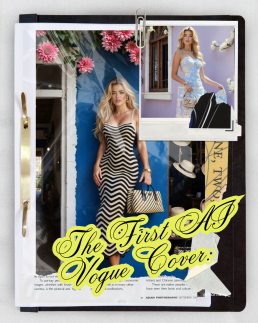
The First AI Vogue Cover: When Fashion Forgets the Humans Behind It
The First AI Vogue Cover
When Fashion Forgets the Humans Behind It
The fashion world loves a headline — and Vogue just delivered one for the history books.
The iconic magazine has unveiled its first AI-generated cover, complete with AI models, digital lighting, and outfits that don’t actually exist. It’s sleek, it’s futuristic… and it’s raising some uncomfortable questions about what happens when “artificial” starts replacing “artistic”.
Because behind every glossy cover used to be an entire team of people.
Photographers, makeup artists, hair stylists, set designers, lighting crews, and of course — models.
Now, it takes one person and an AI prompt.
When One Image Replaces an Entire Industry
A traditional Vogue cover isn’t just a photograph. It’s a collaboration — a symphony of creative roles working in sync to craft something memorable.
But when an AI cover is generated, that human ecosystem collapses into a single digital process.
Here’s who gets left out of the frame:
- The Photographer – no camera, no lens, no creative direction. Just prompts.
- The Model – replaced by a flawless digital avatar with “perfect” proportions.
- The Makeup Artist & Hair Stylist – their artistry becomes a digital render, effortlessly editable and infinitely reproducible.
- The Set Designer – replaced by a 3D background. No props, no lighting, no logistics.
- The Stylist – replaced by AI’s imagined fabric and texture.
- The Retoucher – ironically, AI doesn’t even need retouching.
In one image, dozens of jobs disappear — or at least, become optional.
Fashion photography used to be one of the most collaborative art forms. Now, with AI in the picture, the collaboration is being rewritten — between one creative and a machine.
When Perfection Becomes the Problem
Beyond the job losses, there’s something more insidious happening: AI-generated beauty standards.
These AI models are flawless. Skin like porcelain, hair always in place, bodies symmetrical, lighting perfect.
They don’t age, they don’t get tired, they don’t have pores or insecurities.
And yet, they’re being presented in the same spaces that once celebrated human faces and bodies.
For audiences — especially young women — that’s a dangerous blur.
Social media already fuels enough self-comparison. Now imagine comparing yourself to someone who doesn’t even exist. Someone literally designed to be better than human.
It’s not just unrealistic. It’s unattainable.
AI doesn’t just edit imperfections out of photos; it edits out humanity.
Fashion Without Feeling
Fashion is meant to express identity, culture, and emotion. But AI doesn’t feel — it calculates.
So when a fashion magazine replaces a human face with an algorithmic one, something vital is lost: connection.
When you look at a real photograph, you see a moment of energy between people — a spark between the photographer and the model, the stylist’s vision brought to life. That emotion can’t be coded.
An AI model might look convincing, but it’s not alive. There’s no story behind the eyes, no nerves, no laughter on set, no creative chaos. Just data pretending to be depth.
The Human Cost of Convenience
From a business standpoint, AI covers make sense: no scheduling conflicts, no studio costs, no makeup budgets, no unions.
But from a creative standpoint, it’s a hollow victory.
Each AI image replaces not just one person, but a chain of livelihoods built on human skill, intuition and artistry.
The more brands and magazines lean on automation, the more they risk alienating the very people who built their identity — the creative workforce that made fashion aspirational in the first place.
And let’s be honest: the “efficiency” argument falls flat when what you’re saving is time, but what you’re losing is soul.
What Happens Next?
The first AI Vogue cover may be historic — but whether it’s a step forward or backward depends on what we do next.
AI can be an incredible tool for creatives, helping to prototype ideas, visualise sets, or expand imagination. But when it’s used instead of creatives, it stops being innovation and starts being erasure.
If the fashion world forgets the value of human artistry, it risks becoming sterile — a sea of sameness where everything looks perfect but feels empty.
The challenge now is to find balance.
Let AI assist, not replace.
Let technology expand creativity, not erase the people behind it.
Because no matter how advanced the tech becomes, one thing remains true:
you can’t automate emotion.
In the age of AI models, the most radical thing fashion can do is celebrate the real.

The Online Safety Act Is Here — But the Internet Still Isn’t Safe
The Online Safety Act Is Here
But the Internet Still Isn’t Safe
The UK’s Online Safety Act has officially come into effect, marking what was supposed to be a new era of accountability for online platforms. Designed to protect children and vulnerable users from harmful content, it promises to hold tech giants responsible for what’s shared, seen, and spread online.
But here’s the uncomfortable question — if that’s true, then why can I still see people being murdered on TikTok?
In the same week that the law came into force, graphic videos like the Charlie Kirk shooting and the attack on Iryna Zarutska circulated freely on social media — with millions of views before being removed. Meanwhile, if you’re an adult trying to access explicit content legally, you now need to verify your age with your passport or use a VPN.
It makes you wonder: what kind of internet safety are we really enforcing?
The Internet’s Priorities Are Upside Down
Let’s be clear — pornography has its own complex set of social and moral issues, and age verification is a reasonable idea in principle. But the double standard is staggering.
How can platforms instantly restrict adult content but still allow real acts of violence to circulate freely?
As harmful as porn can be when misused, a violent death is not just “mature content” — it’s trauma, it’s real people’s suffering, it’s grief being turned into clicks.
And frankly, if a child were to stumble across something online, I’d rather it be something confusing or inappropriate than something life-altering and horrifying.
One can be explained. The other can’t be unseen.
A Decade of “Safer Internet” Promises
Ten years ago, the web was far more chaotic. Anyone who grew up online will remember the viral shock sites, dark corners of forums, and the ease with which you could accidentally stumble onto the worst things imaginable.
Since then, platforms like YouTube, Instagram, and Facebook have improved. Content moderation has become stricter; graphic material is removed more quickly, and algorithms are better at recognising harmful imagery.
But TikTok — the app dominating youth culture — still lags behind.
Yes, certain words are censored, certain videos flagged. But violent and distressing clips still slip through, shared and reshared under misleading titles, edited to avoid detection. Sometimes, they’re even reposted by news accounts chasing engagement, blurring the line between journalism and voyeurism.
It’s not just a moderation issue — it’s a moral one.
The Right to Dignity in Death
There’s another uncomfortable layer to this conversation.
If I were to die — especially violently, unexpectedly — I wouldn’t want footage of my final moments plastered across social media for strangers’ curiosity. None of us would.
And yet, that’s exactly what happened to Iryna Zarutska, whose death was turned into viral content before her family could even process what had happened.
Public conversation about tragedy is one thing. But distributing and replaying those final moments crosses a line — from information to exploitation.
There has to be a difference between bearing witness and building clicks.
The Promise vs. the Reality
The Online Safety Act is a step in the right direction. It gives Ofcom new powers to fine and regulate platforms that fail to protect users from harmful content. But laws alone can’t fix what’s become a cultural problem — the normalisation of violence in our feeds.
For safety to mean anything, platforms must apply their rules consistently. If algorithms can detect nipples, they can detect gunfire. If uploads are screened for copyright, they can be screened for trauma.
The technology exists — what’s missing is the will to use it properly.
Reclaiming Humanity Online
Maybe the real question isn’t just how do we make the internet safe for children? but rather, how do we make it humane again?
Somewhere along the way, we started treating tragedy as content. Violence became shareable, death became data, and empathy became secondary to engagement.
If the Online Safety Act is going to mean anything, it has to address that imbalance — not just with censorship, but with care.
Because safety isn’t just about what you can’t see. It’s about what we, collectively, refuse to normalise.
In a world where algorithms decide what’s “acceptable”, maybe the bravest thing we can do is demand an internet that remembers what it means to be human.

Eurovision’s New Logo: Fresh Look or Müller Light Disaster?
Eurovision’s New Logo
Fresh Look or Müller Light Disaster?
After 25 years of glitter, flags and key changes, Eurovision has unveiled a new logo — and fans aren’t exactly singing its praises.
The iconic heart-shaped emblem, synonymous with sequins, chaos and continental unity, has had a long-awaited refresh. But instead of applause, the internet has responded with confusion, memes and… yoghurt jokes.
Apparently, after a quarter of a century, Eurovision decided to go minimalist. The result? A look that’s clean, modern, and very, very corporate — but perhaps too clean for a show that’s built on camp and chaos.
25 Years Later — A New Tune for Eurovision’s Identity
The previous logo, introduced in 2004, had a distinctive handwritten style with a heart in the middle of the word “Eurovision” containing the host country’s flag. It was expressive, playful, and full of personality — exactly what you’d expect from a show that once gave us ABBA, Conchita Wurst, and a man in a hamster wheel.
The new design, however, strips much of that away.
Gone is the messy charm of the brush-script lettering. In its place: a sleek, geometric wordmark, with a rounded sans-serif font and a simplified heart symbol.
It’s the kind of design that screams “brand guidelines”, not “Balkan power ballad”.
And that lowercase ‘e’? It’s become the talking point. Some say it looks unbalanced. Others say it’s trying too hard to be friendly. Most people just… don’t like it.
“Pampers chic” and “Müller Light vibes”
Naturally, the internet did what it does best — it memed.
On X (formerly Twitter), users compared the new look to the Pampers logo, pointing out the teal-to-turquoise palette and soft curves that wouldn’t look out of place on a baby-care product.
Others joked that it had “Müller Light yoghurt energy” — gentle, pastel, and strangely hygienic.
It’s hard to ignore the resemblance. The new Eurovision wordmark has that ultra-smooth, corporate-wellness aesthetic that feels more “brand of probiotic drink” than “international song contest with pyrotechnics and sequins”.
For a show famous for glitter, drama and unapologetic weirdness, this new logo feels… a bit beige.
Why Fans Are So Protective of the Old Logo
Eurovision fans are loyal — sometimes to the point of obsession — and the visual identity is part of that. The heart logo and handwritten wordmark became an emblem of inclusion and joy, instantly recognisable across Europe (and beyond).
The rebrand feels like it’s trying to bring Eurovision in line with modern corporate design trends — lowercase letters, rounded fonts, minimalist layout — but in doing so, it risks losing the individuality that made it iconic.
It’s a reminder that not every brand needs to go “clean and simple”. Some identities thrive on excess. Eurovision, of all things, should embrace that.
A Case of Over-Designing the Undesigned
There’s a wider conversation here about how so many major brands have flattened their logos in the name of “modernisation”. From Burger King to Burberry, everyone’s chasing a minimalist aesthetic that works well on mobile screens but sometimes strips away character.
Eurovision’s new logo might work in digital formats — it’s easy to animate, clear at any size, and adaptable for each host nation. But it also feels like it was designed to avoid offending anyone — which, ironically, is very un-Eurovision.
Design Is About Feeling — and Fans Aren’t Feeling It
At its core, Eurovision is about connection, chaos and collective joy. It’s over the top by nature — and that’s its magic. The new logo, while technically polished, feels too restrained, too quiet, too “brand-safe” for a contest that celebrates weirdness.
Design should make people feel something. This one mostly makes people feel… meh.
Final Verdict
Refreshing a brand after 25 years is no small feat, and visually, Eurovision’s new logo ticks the right boxes for scalability and consistency. But emotionally? It misses the mark.
Maybe in time it’ll grow on us — or maybe, like a catchy but forgettable entry from San Marino, it’ll fade into the background.
For now, though, the verdict is clear:
Eurovision’s new look might be clean, but it’s lost the sparkle that made it sing.
Design takeaway:
Sometimes a little chaos is the most memorable design choice of all.

The “African” Font That Isn’t African at All
The “African” Font That Isn’t African at All
You’ve seen it before — bold, jagged lettering used on movie posters, safari tours, charity campaigns, and restaurant signs. The so-called “African” font: earthy tones, tribal patterns, uneven strokes. It’s meant to evoke the continent’s “vibe” — wild, raw, authentic.
But here’s the catch: most of those fonts weren’t designed in Africa at all.
They were designed in America, by designers who’ve often never set foot on the continent.
And that simple fact says a lot about how Western media continues to shape — and stereotype — African identity through design.
When Aesthetic Becomes Assumption
The “African-style” font as we know it didn’t emerge from African typographic traditions. It emerged from Hollywood.
Think of posters for films like The Lion King, Out of Africa, or Madagascar. Each one uses typefaces that share a certain look — irregular strokes, uneven letterforms, and earthy, ochre tones. The design shorthand says “Africa”, but what it’s really saying is “a Western fantasy of Africa”.
These fonts are often bundled on stock websites or in font libraries under names like Safari, Tribal, or Zebrawood. They’re built to communicate exoticism, wilderness, or adventure — not the diverse, contemporary realities of 54 different countries.
In short, they’re not cultural representation. They’re branding.
The Problem With Design Shortcuts
Typography is storytelling. It carries history, emotion, and identity — whether you realise it or not.
So when a single “African” font becomes the go-to design choice for anything related to the entire continent, it flattens centuries of culture into a cartoon aesthetic. It tells audiences that Africa is one monolithic “vibe”, not a tapestry of languages, scripts, and design traditions.
Even worse, it continues the colonial-era habit of defining Africa through an outsider’s lens — one that’s exotic, primitive, or untamed.
The irony? While American studios were designing these “tribal” fonts, African designers were already creating contemporary typefaces inspired by Akan symbols, Amharic script, Nsibidi, Ge’ez, N’Ko, and Arabic calligraphy — fonts that rarely make it into Western media kits or corporate brand decks.
Designing Without Context
To be clear, the issue isn’t just about who designs a font — it’s how it’s used.
A font inspired by traditional patterns or shapes isn’t inherently offensive. But when it’s applied carelessly — slapped onto film titles, travel brochures, or charity posters — it becomes a shorthand for “otherness”.
It’s the design equivalent of using a drumbeat to signal “Africa” in a movie soundtrack.
It’s lazy, outdated, and reductive.
Good design requires context. It requires understanding. And if a font is being used to “represent Africa”, that understanding should come from African designers, artists, and typographers themselves.
Reclaiming the Narrative
The good news is that this is already changing.
Across Africa, designers are reclaiming their visual identities — not through imitation of Western styles, but by drawing from their own heritage in new, innovative ways.
Studios in Lagos, Nairobi, Cape Town and Accra are creating fonts rooted in local languages and aesthetics. Projects like African Typeface Design and TypeFoundry ZA are reshaping what African design looks like in the global space.
It’s design by Africans, for everyone — not design by Americans, for Western expectations of what “Africa” should feel like.
Why It Matters
Fonts aren’t neutral. They communicate ideas long before you read the words they spell out.
When the same visual clichés are used again and again, they reinforce the same narrow story — one where Africa is exotic, undeveloped, or “wild”.
Designers hold power in shaping perception. And that means questioning where our fonts, colour palettes and “themes” really come from — and whose story they tell.
Because cultural appreciation and cultural appropriation often look the same on the surface — it’s the intention and understanding beneath that makes all the difference.
So next time you see a “tribal” font used to represent Africa, ask yourself — is this really African design, or just another American interpretation of it?

A Font Born from Misunderstanding
A Font Born from Misunderstanding
The origins of the stereotypical “Chinese-looking” font go back to the early 20th century, when Western printers began designing typefaces that would “look Oriental” to Western audiences.
They used brushstroke-like strokes, squared-off serifs, and sharp corners meant to mimic Chinese calligraphy — but only visually, not linguistically. These fonts had nothing to do with real Chinese type design or traditional writing systems.
Fonts like “Wonton,” “Chop Suey,” and “Chinese Takeaway” (yes, those are real names) were created in the United States, designed by white typographers who wanted to evoke “exoticism” and “mystery.”
It wasn’t about communication — it was about aesthetic stereotype.
Typography as Costume
In Hollywood’s Golden Age, these fonts became shorthand for anything vaguely “Asian.”
Movie posters, restaurant signs, and even TV shows used them as visual cues: the letters themselves were a costume — a quick way to say “this is Chinese” without needing to understand the culture.
You didn’t need to read Chinese to “get it.” The font did the talking.
But here’s the problem: it wasn’t speaking Chinese — it was speaking American fantasy.
Designing Identity from the Outside In
Just like the so-called “African” fonts designed in the West, these “Chop Suey” typefaces compress an entire civilisation into a single visual trope.
They take the complex beauty of Chinese calligraphy — one of the world’s oldest and most revered art forms — and flatten it into a gimmick: angular, symmetrical, and conveniently “foreign.”
It’s the visual equivalent of using a gong sound in a movie whenever a Chinese character appears.
Instant recognition, zero understanding.
How It Persists Today
You might think we’ve outgrown this — but take a walk through any Western city’s “Chinatown,” or glance at the branding of an “Asian-fusion” restaurant, and you’ll still see it: that same stereotypical typeface, often paired with red and gold colouring.
It’s not always malicious, but it is lazy.
Designers reach for these fonts because they’ve been coded into visual culture for decades. They signal “Chinese” to Western audiences, even if they’re historically and culturally inaccurate.
Meanwhile, real Chinese typography has evolved with incredible sophistication — from elegant Songti typefaces to experimental Simplified Chinese Sans-serifs used in tech and fashion. Yet these authentic designs rarely make it into Western branding.
The Bigger Issue: Who Designs for Whom
This isn’t just about one typeface — it’s about power and perspective in design.
For centuries, Western media has been in the habit of defining other cultures visually — reducing entire identities into symbols that feel familiar to them.
When design is created about a culture rather than from within it, it tends to tell one story: the outsider’s.
And when those same visual clichés are used over and over, they stop being “design language” and start being stereotype.
Reclaiming Authentic Typography
Thankfully, there’s a growing movement of Chinese and East Asian designers pushing back.
Independent studios in Beijing, Shanghai, Taipei and Hong Kong are creating new typefaces that blend modern design with traditional calligraphy — fonts that reflect real cultural aesthetics, not caricatures of them.
Projects like Pangram Pangram’s collaborations with Chinese typographers and TypeLand China’s work on contemporary Chinese scripts are proving that global design doesn’t need to rely on outdated tropes to feel recognisable.
The future of typography is inclusive — and that means letting cultures design themselves.
Design Is Language — So Let’s Use It Responsibly
Fonts are more than decoration; they’re communication.
When a font pretends to represent an entire culture but is rooted in stereotype, it doesn’t just misinform — it diminishes.
It’s time designers ask tougher questions:
Who made this? Who is it for? And what story does it tell?
Because if the “Chinese” font was born in America, maybe it’s time we stop calling it Chinese — and start calling it what it really is: a Western fantasy of the East.
Typography tells stories. Let’s make sure they’re the right ones.

From Pantone’s Colour of the Year to the Ugliest Colour in the World
From Pantone’s Colour of the Year to the Ugliest Colour in the World
Every December, designers, trend forecasters and brand strategists hold their collective breath waiting for one announcement: the Pantone Colour of the Year.
It’s a tradition that shapes fashion collections, marketing palettes and Instagram feeds for months. The colour isn’t just a shade, it’s a statement about mood, emotion, and culture.
Pantone calls it “a snapshot of what we see taking place in our global culture.”
But while we celebrate colour as art and emotion, there’s another, far darker side to colour psychology, one that’s used not to attract, but to repel.
Colour That Inspires — and Colour That Discourages
Each year, Pantone tells us what’s in.
From Viva Magenta to Classic Blue and Peach Fuzz, these shades are chosen for how they make us feel: hopeful, energetic, calm, connected.
But what about colours chosen specifically to make us feel the opposite, disgust, discomfort, even shame?
That’s where the infamous “world’s ugliest colour” comes in.
Meet Pantone 448C: The Colour Designed to Make You Quit
Back in 2012, the Australian government commissioned a study to find a colour that would make cigarette packaging as unattractive as possible. After testing dozens of shades with focus groups, they found a clear winner, or rather, loser.
Pantone 448C, a murky brown-green-grey, was officially declared the world’s ugliest colour.
Psychologists described it as “dirty”, “deathly”, and “tar-like”. Focus groups associated it with decay, filth, and sickness.
It was so repulsive that it became the standard colour for plain cigarette packaging, deliberately chosen to make smoking feel less glamorous and more grim.
And it worked.
Australia saw a noticeable decline in smoking rates after the packaging change, and several countries, including the UK, France and New Zealand, followed suit.
A single colour had changed behaviour.
The Psychology Behind the Palette
We often think of colour as aesthetic — a creative choice. But colour is psychological before it’s visual. It speaks to our instincts.
- Warm colours (reds, oranges) evoke passion, energy and appetite.
- Cool tones (blues, greens) feel calm, clean, trustworthy.
- Muted tones — especially browns and greys — can feel lifeless or institutional.
That’s why Pantone 448C was so effective: it stripped away the allure. It took something once designed to feel sleek and desirable, and rebranded it as something repulsive.
It’s a clever inversion of what brands normally do — colour not to attract, but to discourage.
Colour as Communication
The contrast between Pantone’s joyful Colour of the Year campaigns and the government’s anti-smoking palette highlights something fascinating: colour can carry meaning without words.
Pantone uses colour to express emotion, to unify global design under shared optimism.
Governments use colour to influence public behaviour and perception.
Both rely on the same truth, colour speaks directly to the subconscious.
Designers already know this intuitively: a good colour choice can sell a product, shift a mood, or define a brand. But the “ugliest colour in the world” reminds us that design can also serve a social purpose, that sometimes, beauty isn’t the goal.
Beauty, Behaviour, and Branding
There’s a poetic irony in how colour theory bridges design and psychology.
While brands chase Pantone trends to appear relevant or aspirational, governments use the very same science to save lives.
It shows that colour isn’t neutral; it carries cultural, emotional, and even ethical weight.
What’s “beautiful” in one context might be “disgusting” in another, depending entirely on what we’re trying to achieve.
Maybe that’s the real lesson behind Pantone’s yearly ritual: it’s not just about the colour we celebrate, but how we understand the power of colour itself.
From inspiring art to discouraging addiction, colour design sits quietly at the crossroads of creativity and psychology — shaping how we feel, and sometimes, how we behave.
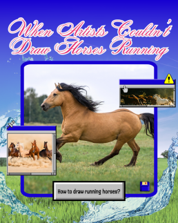
When Artists Couldn’t Draw Horses Running
When Artists Couldn’t Draw Horses Running
When Artists Couldn’t Draw Horses Running
Before photography galloped into the picture, even the greatest artists were getting one thing consistently and hilariously wrong:
How horses run.
For centuries, painters and sculptors depicted galloping horses with their legs stretched out like leaping greyhounds, front legs forward, back legs extended behind, suspended in mid-air, frozen in a majestic, yet physically impossible stride.
It looked powerful. It looked elegant. It looked completely wrong.
Before the Lens, There Was Guesswork
Before cameras, artists had only one tool for capturing motion: observation.
But the human eye and brain can’t process movement that fast. Horses gallop at such speed that, without photographic reference, it’s impossible to see the exact positioning of their legs.
So, for centuries, artists simply guessed.
They used logic and aesthetics instead of science. If a horse runs fast, surely its legs must stretch far apart, right?
It was a natural assumption, until technology proved otherwise.
Enter Eadweard Muybridge: The Man Who Froze Motion
In the 1870s, a man named Eadweard Muybridge, a British photographer working in the United States, was hired to solve a hotly debated question:
When a horse gallops, are all four hooves ever off the ground at once?
To find out, Muybridge set up a line of cameras triggered by tripwires along a racetrack.
The resulting series of photographs, captured in rapid succession, revealed something no one had ever seen before.
Yes, all four hooves do leave the ground, but not when the legs are stretched out.
Instead, it happens when the legs are tucked under the body, mid-stride, the complete opposite of what centuries of art had shown.
It was a revelation.
And it changed the way people understood movement forever.
When Art Meets Evidence
Muybridge’s photos didn’t just correct an artistic mistake, they shifted how humans thought about seeing, truth, and representation.
For the first time, artists and scientists had proof that the eye could deceive.
Movement, once fluid and mysterious, could now be dissected frame by frame.
Painters, sculptors and animators began to study these sequences, leading to more realistic depictions of not just horses, but all living motion.
You can see Muybridge’s influence ripple through everything from classical painting to early animation to the biomechanics used in CGI today.
The Poetry of Imperfection
And yet, there’s something charming about those pre-photography depictions.
They remind us that art isn’t just about accuracy, it’s about interpretation.
When artists painted horses before photography, they weren’t trying to lie. They were capturing the feeling of speed, power, and grace, the essence of motion, rather than its exact mechanics.
In a way, those elongated, impossible strides were more about emotion than anatomy.
They show how art has always been a collaboration between imagination and perception, a dialogue between what we think we see and what we feel to be true.
Technology and Truth
The horse paintings of the pre-photography era tell a larger story about technology’s role in art.
Every new tool, from the camera to AI, reshapes how we define creativity.
When photography arrived, artists didn’t become obsolete. They adapted. Impressionists like Degas and Monet began using photographic reference and motion studies to create new forms of realism — emotional, fleeting, human.
In the same way, today’s artists are learning to coexist with digital tools and AI, finding new ways to express timeless questions:
What’s real? What’s beautiful? What’s worth capturing?
A Gallop Through Time
So next time you see an old painting of a horse sprinting with legs stretched out like a cartoon, smile. It’s not a mistake. It’s a snapshot of a world before cameras, before slow motion, before science could catch up with imagination.
It’s proof that art has always been about more than getting it right.
It’s about trying to see, and sometimes, the trying itself is what makes it beautiful.
Because long before photography showed us the truth, art taught us to look for it.
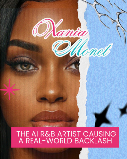
Xania Monet: The AI R&B Artist Causing a Real-World Backlash
Xania Monet
The AI R&B Artist Causing a Real-World Backlash
The music industry has officially entered a new era — one where record deals aren’t just being signed by singers, but by software.
This month, the internet has been buzzing over Xania Monet, an AI-generated R&B artist who reportedly signed a multi-million-dollar record deal with Hallwood Media after climbing the Billboard R&B Airplay charts.
She’s got a voice, a catalogue, a label — everything you’d expect from a real artist. Except she isn’t one.
Xania Monet doesn’t exist. Not in the way we understand existence.
And not everyone’s applauding.
A New Kind of Star
Xania Monet was created by Telisha “Nikki” Jones, a poet and lyricist from Mississippi, who used the AI music platform Suno to bring her creative vision to life.
Monet’s songs are sultry, soulful, and algorithmically perfect — her tone silky, her rhythm precise, her imperfections… nonexistent.
On paper, it sounds revolutionary: an artist who can sing forever, never gets tired, and doesn’t need a recording booth, tour budget, or vocal warm-up.
But to many musicians, it’s not innovation. It’s an invasion.
The Backlash Begins
The announcement of Monet’s record deal was met with immediate backlash across social media and within the music community.
Kehlani, the acclaimed R&B singer-songwriter, was one of the first to speak out.
In a viral post, she said:
“There’s an AI R&B artist who just signed a multi-million dollar deal… and the person is doing none of the work. Nothing and no one on Earth will ever be able to justify that to me.”
It’s a sentiment shared by many: that celebrating a machine-made artist in a genre built on emotion, storytelling, and lived experience feels like a betrayal of everything R&B stands for.
Because R&B isn’t just about sound — it’s about soul.
When the Machine Sings the Blues
There’s something almost poetic about an AI entering the world of R&B — a genre rooted in human vulnerability, pain, and love.
The irony isn’t lost on anyone.
How can a non-human entity sing about heartbreak, desire, or loss when it can’t feel any of those things?
For many artists, the rise of AI performers threatens to reduce art to data — stripping away the humanity that makes music meaningful.
Even if Xania Monet’s songs sound beautiful, they’re missing something invisible yet vital: a heartbeat.
The Industry’s AI Obsession
Record labels see AI differently.
They see efficiency. Consistency. Control.
An AI artist doesn’t demand royalties, take holidays, or go off-script in interviews.
It can be replicated endlessly, customised for audiences, and marketed across multiple languages.
It’s a label’s dream — and a human artist’s nightmare.
But there’s another layer too: AI models like Monet are trained using existing music. That means fragments of real artists’ vocals, melodies, and styles may have been used to create her sound — without their consent.
For many, that’s not innovation. It’s exploitation.
A Question of Authenticity
Every generation of musicians faces disruption — from autotune to streaming, technology has always redefined what’s possible.
But AI feels different because it doesn’t just enhance human creativity — it replaces it.
When an algorithm can now perform, produce, and promote itself, we’re forced to ask:
Where does human artistry fit in?
And more importantly:
Will audiences actually care who — or what — made the music, as long as it sounds good?
The Heart of the Matter
R&B is a genre that’s always been about emotion and truth — from Aretha Franklin to SZA. It’s the sound of real experience.
That’s why Kehlani’s response hit a nerve.
Her frustration isn’t just about job security — it’s about meaning.
Art isn’t just about output; it’s about connection.
AI can write, sing, and simulate emotion — but it can’t feel it.
And maybe that’s the point where audiences will draw the line.
The Future: Collaboration or Competition?
Xania Monet’s rise doesn’t have to spell the end of human artistry — but it should serve as a wake-up call.
If used responsibly, AI could be a collaborator — helping artists experiment, compose, or visualise ideas in new ways.
But when AI becomes the artist, it raises a deeper ethical question: what does it mean to create, when creation no longer requires being alive?
Whether you love or hate her, Xania Monet is here to stay — a mirror held up to an industry that’s racing ahead faster than it can define its own values.
The real challenge now isn’t whether AI can make music.
It’s whether music made by AI can still move us.
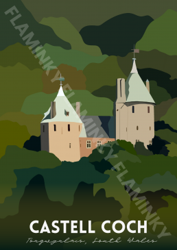
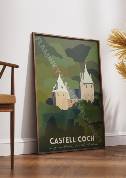
Castell Coch - £25.00
Castell Coch Illustration
£25.00
Castell Coch is a digitally hand-drawn illustration from the Places Series, capturing the fairytale charm of this 19th-century Gothic Revival castle nestled in the lush woodlands of Tongwynlais, South Wales. The artwork highlights the castle’s striking turrets and pointed roofs as they emerge from dense green forest, evoking both mystery and enchantment. With bold colour blocking and a modern poster art style, the piece celebrates one of Wales’ most picturesque landmarks.
Style
Digital hand-drawn illustration with poster art influences and bold, simplified forms
Subject
Castell Coch, a Gothic Revival castle, framed by dense woodland in South Wales
Background
Deep green layers of forest, creating contrast with the castle’s pale stone and rooftops
Series
Places | Welsh Places
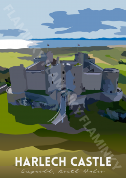
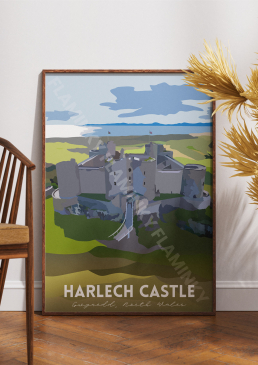
Harlech Castle - £25.00
Harlech Castle Illustration
£25.00
Harlech Castle is a digitally hand-drawn illustration from the Places Series, portraying the dramatic beauty of this UNESCO World Heritage Site in Gwynedd, North Wales. The artwork highlights the castle’s commanding stone walls perched atop a rugged hill, with sweeping views of the countryside and the sea beyond. Using bold colour blocking and a clean poster art style, the piece captures both the strength of medieval architecture and the natural beauty of its coastal setting.
Style
Digital hand-drawn illustration with poster art and bold color blocking
Subject
Harlech Castle in Gwynedd, North Wales, emphasizing its imposing fortress structure and elevated position
Background
Expansive countryside and coastal horizon under a cloud-dotted sky
Series
Places | Welsh Places