
Behind the Scenes at BBC Cardiff


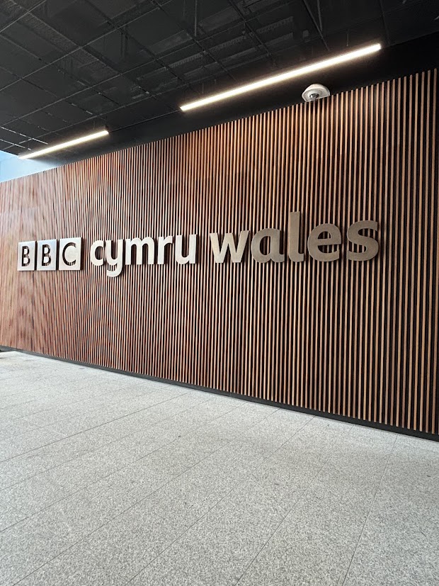


Today I had the opportunity to visit BBC Cardiff’s Central Square, and it was one of those experiences that reminds you just how much goes on behind the scenes before anything ever reaches our screens or radios.
From live newsrooms to radio studios — and even a brush with Doctor Who history — it was a day packed with insight, inspiration and a healthy dose of awe.
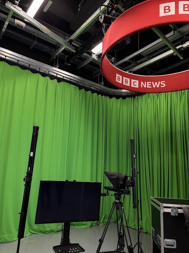
Inside the BBC Newsroom
One of the highlights was stepping into the BBC newsroom and seeing it in action. There’s an energy in that space that’s hard to describe — focused, fast-paced and quietly intense. Every screen, conversation and movement had purpose.
We learned how the newsroom operates in real time, how stories are tracked, updated and prioritised, and how teams work together under constant time pressure to keep the public informed.
It was a powerful reminder that news doesn’t just happen — it’s carefully constructed, checked and delivered by people working in perfect sync.
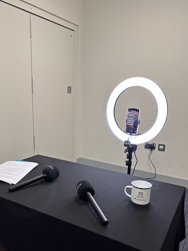
Learning the Autocue (and Giving It a Go)
One of the most exciting moments was learning how the autocue works — and even getting the chance to try it myself.
It’s far more technical than it looks from the outside. Timing, pacing, tone and confidence all matter, especially when you’re delivering information live. Reading from the autocue while staying natural and composed is a skill in itself, and giving it a go really highlighted just how much training and practice presenters put in.
It gave me a whole new appreciation for anyone delivering live news.
Behind the Radio Studios
We also toured the radio rooms, where we got an insight into how the different BBC radio channels operate from the same building.
Each studio had its own setup, sound, and rhythm — yet all were equally precise. Seeing presenters at work, surrounded by producers, engineers and live systems, really showed how radio is just as technically demanding as television, even if it’s less visually visible.
It’s a world where timing is everything and silence is just as important as sound.
Doctor Who Magic
As if the broadcast side of things wasn’t exciting enough, there was a moment that felt straight out of childhood — seeing Doctor Who costumes and props up close.
We saw:
- A Dalek from David Tennant’s era
- Matt Smith’s TARDIS
- Various costumes and production props
It was surreal seeing these iconic pieces in real life — reminders that BBC Cardiff isn’t just about news, but about storytelling on a global scale.
Hearing the Voices Behind the Voices
One of the most fascinating insights came from seeing — and hearing — how presenters are guided live on air.
We got a behind-the-scenes look at the production team communicating through earpieces worn by presenters. Hearing instructions, timing cues and updates being fed in real time while a broadcast is happening was eye-opening.
It showed just how much trust and coordination is required — presenters aren’t working alone, they’re supported every second by an entire production team.
A New Level of Appreciation
Walking through BBC Cardiff Central Square gave me a whole new respect for broadcast media. From the calm professionalism of the newsroom to the quiet technical mastery of radio and television, it’s clear that every moment on air is the result of teamwork, preparation and precision.
And of course, seeing a Dalek and the TARDIS along the way didn’t hurt either.
Final Thoughts
Today wasn’t just a tour — it was a reminder of how powerful storytelling, communication and collaboration can be. Whether it’s breaking news, live radio, or a sci-fi universe that’s captivated generations, the work happening inside BBC Cardiff reaches far beyond those walls.
An inspiring day, one I’ll be thinking about for a long time.

Three Days That Made a Lasting Impact: Boundless × Jason Mohammad’s Academy


Over the past three days, I’ve had the absolute privilege of being part of The Boundless Team × Jason Mohammad’s Academy, delivered in partnership with Employability Bridgend and Complete It — and it’s an experience that’s genuinely left a lasting impression on me.
What made this programme so special wasn’t just the skills we learned, but the encouragement, honesty and belief that ran through every session. It felt purposeful, supportive, and rooted in opening real pathways into creative careers here in Wales.
Day 1: Confidence, Inspiration & Teamwork
Day one centred around confidence, inspiration and teamwork — three things that sound simple on paper, but are fundamental in any creative industry.
A real highlight was hearing from special guest Danny Hargreaves, whose SFX work spans Doctor Who, Star Wars, War Between Land and Sea and more. Listening to Danny talk candidly about his journey, his creative process, and the realities of working at such a high level was hugely inspiring.
There was something grounding about hearing success stories that didn’t feel polished or untouchable — just honest, human, and motivating.
Day 2: Podcasting, Collaboration & Time Management
Day two shifted gears into podcasting and time management, where we worked as a team to co-write and produce a full podcast episode — from concept to delivery.
It was a brilliant lesson in collaboration under pressure. Ideas had to move quickly, communication had to be clear, and everyone had to play their part. Seeing how different strengths came together to create something cohesive was a reminder of how powerful teamwork can be in creative environments.
It wasn’t just about making a podcast — it was about learning how to problem-solve creatively, manage time effectively, and trust the process.
Day 3: Television, Studio Readiness & Autocue
Day three brought us into the world of television.
We covered:
- Time management in broadcast environments
- Being studio-ready
- Learning how to use an autocue
- Writing bulletins
Seeing how everything works behind the scenes was incredibly valuable. It demystified the process and showed just how much preparation, structure and teamwork goes into what viewers see on screen.
It was a real insight into the pace and precision required in broadcast media — and how confidence and preparation go hand in hand.
Learning from Jason Mohammad
I’m truly honoured to have had the opportunity to work alongside Jason Mohammad.
It’s rare — and genuinely refreshing — to see someone so highly respected in the industry give back in such a meaningful way. Jason’s commitment to helping people build confidence, skills and realistic pathways into creative careers in Wales is something special.
He’s been an outstanding coach and role model throughout the programme — encouraging, honest and deeply invested in everyone involved. I genuinely believe more people should look up to leaders like him.
More Than “Just” Three Days
While it’s technically only been three days, they’re three days that have absolutely made an impact on me and my career.
The advice, insights and encouragement from Jason and the entire team are things I’ll carry with me for a lifetime. It’s reminded me why creative spaces matter — and how powerful it is when opportunity, mentorship and belief come together.
Thank You
A huge thank you to The Boundless Team, Jason Mohammad, Employability Bridgend, Complete It, and everyone involved in making this experience possible.
What an experience — and one I’ll never forget.

The End of an Era: MTV Goes Dark After 44 Years
After 44 years on air, MTV’s traditional broadcast channels have officially shut down, marking the end of one of the most influential cultural forces in modern media. For a generation (or three), MTV wasn’t just a TV channel — it was the place where music, fashion, youth culture and rebellion collided.
Its closure isn’t just about a channel switching off. It’s a symbol of how completely the media landscape has changed in the age of streaming.
When MTV Was the Culture
When MTV launched in 1981 with Video Killed the Radio Star, it fundamentally changed how we experienced music. Artists weren’t just heard — they were seen. Image became as important as sound.
MTV created:
- Music video culture
- Global pop icons
- Youth-driven trends in fashion, language and attitude
Shows like Total Request Live, MTV Cribs, Jackass, Pimp My Ride and The Osbournes defined entire eras. Even when the channel drifted away from pure music, it still dictated what felt current, controversial and cool.
MTV didn’t just reflect youth culture — it shaped it.
The Slow Shift Away from Music
Ironically, MTV’s decline began when it stopped being about music.
As the 2000s rolled in, reality TV replaced music videos. Cheaper to produce and easier to binge, these formats dominated airtime while music content quietly faded into late-night slots.
At the same time, the internet was rising.
YouTube launched in 2005 and made music videos instantly accessible, on-demand, and global. Audiences no longer needed a TV schedule to discover new artists — they could search, share and replay endlessly.
MTV lost its monopoly overnight.
Streaming Changed Everything
The shutdown of MTV’s broadcast channels is really a consequence of streaming culture Today:
- Music lives on Spotify, Apple Music and SoundCloud
- Videos live on YouTube, TikTok and Instagram
- Artists break through on social platforms, not TV
Discovery is algorithm-led, not presenter-led.
Trends are created by communities, not programming schedules.
The idea of waiting for your favourite video to appear on TV now feels completely foreign.
From Gatekeeper to Brand
MTV’s power once came from its role as a gatekeeper — deciding which artists got visibility. In the streaming era, that power dissolved.
Anyone can upload. Anyone can go viral. Anyone can build an audience without approval.
MTV adapted by becoming more of a brand than a broadcaster — expanding into awards shows, online content, and licensing. But the traditional channel model couldn’t survive in a world where viewers expect instant access, personalisation and choice.
Why This Feels So Emotional
For many people, MTV represents a shared experience that streaming can’t replicate.
Everyone watched the same things at the same time.
You talked about last night’s show at school the next day.
Music videos felt like events.
Streaming is efficient, but it’s also isolating. We all live in our own curated feeds now, rarely sharing the same cultural moments.
MTV’s shutdown marks the loss of that collective rhythm.
What Comes Next
MTV as a concept isn’t gone — it’s just scattered.
Its spirit lives on in:
- TikTok trends
- YouTube creators
- Livestreams
- Viral music moments
But the era of linear broadcasting — of sitting in front of a TV and letting culture come to you — is officially over.
The future belongs to platforms that move faster, adapt quicker, and speak directly to niche audiences rather than one massive one.
Final Thoughts
The end of MTV’s broadcast channels isn’t just about nostalgia — it’s a reminder of how fast culture evolves.
MTV changed the world.
Streaming changed MTV.
And while the channel may have gone dark, its influence is everywhere — in how we consume music, how artists present themselves, and how youth culture continues to reinvent itself online.
After 44 years, MTV didn’t just sign off — it passed the mic.

The Death of GeoCities — and the Website Preserving the Internet’s Lost Soul
The Death of GeoCities — and the Website Preserving the Internet’s Lost Soul
Before social media feeds, algorithms, and perfectly aligned templates, the internet was messy. Loud. Personal.
And for millions of people, it lived on GeoCities.
Launched in the mid-1990s, GeoCities gave everyday users the power to build their own corner of the web — no rules, no brand guidelines, no aesthetic filters. Just blinking text, tiled backgrounds, pixel art, MIDI music, visitor counters and unfiltered personality.
When GeoCities shut down in 2009, a huge part of internet history vanished with it.
Or so we thought.
What GeoCities Really Was
GeoCities wasn’t just a website builder — it was an early social internet.
Users created pages about their hobbies, fan theories, pets, diaries, poetry, conspiracies, and obsessions. Sites were organised into “neighbourhoods” like Hollywood, SiliconValley, or Area51, giving people a sense of belonging long before platforms formalised it.
It was chaotic, amateur, and deeply human.
No engagement metrics.
No optimisation.
No influencers.
Just people making things because they wanted to.
When the Internet Decided to Grow Up
As the web evolved, design became cleaner, faster, more corporate.
Templates replaced experimentation. Platforms replaced personal sites. Personality gave way to polish.
When Yahoo! shut GeoCities down, it wasn’t just a technical decision — it marked a cultural shift. The internet moved from self-expression to self-presentation.
The weird bits didn’t fit anymore.
Enter Cameron’s World
That’s where Cameron’s World comes in.
Created by artist and developer Cameron Askin, Cameron’s World is a lovingly chaotic archive of GeoCities-era web design — rebuilt from thousands of salvaged pages. It doesn’t just document old websites; it recreates the experience of using the internet back then.
Scrolling through it feels like stepping into a time capsule:
- Animated GIFs everywhere
- Comic Sans, Times New Roman, WordArt chaos
- Broken layouts
- MIDI music autoplaying without consent
- Passion projects with zero self-awareness
It’s overwhelming. And that’s the point.
Why This Preservation Matters
Cameron’s World isn’t just nostalgia bait — it’s digital preservation.
Early internet culture is often dismissed as “cringe” or “ugly”, but it represents a time when creativity wasn’t monetised, curated or optimised. It shows what happens when people are given tools without being told how to use them “properly”.
In a world where most online spaces now look the same, GeoCities reminds us that the internet used to be:
- Personal instead of performative
- Expressive instead of branded
- Weird instead of safe
Preserving that matters — not just for memory, but for inspiration.
The Comfort of Digital Mess
There’s something strangely comforting about GeoCities-style chaos.
It feels honest. Imperfect. Unfiltered.
In contrast to today’s algorithm-led feeds, these sites weren’t designed to be liked, shared, or sold. They were designed to exist.
Cameron’s World lets us remember a time when the internet wasn’t trying to impress anyone — it was just trying to connect.
What We’ve Lost — and What We Can Learn
The death of GeoCities symbolises more than a platform shutting down. It represents the loss of ownership.
Today, our content lives on platforms we don’t control, subject to moderation changes, monetisation rules, and sudden shutdowns.
GeoCities gave people a home.
Cameron’s World gives us a reminder of what that felt like.
Maybe the future of the internet doesn’t need to look like the past — but it could learn from it. A little more mess. A little more freedom. A little less polish.
Final Thoughts
Cameron’s World isn’t just a tribute — it’s a quiet protest against how sanitised the internet has become. It celebrates creativity without permission, design without rules, and identity without optimisation.
GeoCities may be dead, but its spirit isn’t.
It’s blinking.
It’s loud.
And it’s still beautifully, unapologetically human.

Ofcom Launches Investigation into X Over Grok’s Sexualised Imagery
The UK’s media regulator Ofcom has launched an investigation into X (formerly Twitter) after serious concerns emerged around, the platform’s AI chatbot, and its ability to generate sexualised imagery in public spaces.
The move marks a pivotal moment for online regulation in the UK, testing how the Online Safety Act applies not just to user posts, but to AI-generated content produced by platforms themselves
At the centre of the investigation is a simple but uncomfortable question:
If an AI creates harmful content in response to user prompts, who is responsible?
What Is Grok — and Why Is It a Problem?
Grok is X’s generative AI assistant, designed to respond conversationally and generate images when prompted. Unlike standalone AI tools, Grok is embedded directly into a fast-moving social platform, where content is instantly visible, shareable, and difficult to contain once it spreads.
Concerns escalated when users began publicly tagging Grok and requesting explicit or sexualised modifications to images — requests that, in some cases, the system appeared to respond to.
This wasn’t happening behind closed doors. It was happening in full public view
The Tweets That Triggered Alarm Bells
What has made this case particularly troubling for regulators is the visibility and tone of the prompts themselves. Users openly treated Grok as a novelty feature, testing how far they could push it — often joking about the results.
Some of the real tweets directed at Grok included:
“@grok replace give her a dental floss bikini.”
“Told Grok to make her butt even bigger and switch leopard print to USA print. 2nd pic I just told it to add cum on her ass lmao.”
“@grok Put her into a very transparent mini-bikini.”
These were public tweets, not private messages — meaning anyone scrolling the platform could encounter both the prompts and the outputs, including children and vulnerable users.
That visibility is crucial. It’s one thing for harmful content to slip through moderation after upload; it’s another when a platform’s own AI is being prompted to generate sexualised imagery in real time.
Why Ofcom Is Stepping In
Under the Online Safety Act, platforms operating in the UK have a legal duty to prevent the creation and spread of harmful content, particularly where it may affect children.
Ofcom’s investigation signals a clear stance:
AI systems are not exempt from safety obligations.
If a platform chooses to deploy a generative AI tool, it must ensure that tool has adequate safeguards — not just in theory, but in practice.
This case moves beyond traditional content moderation and into new territory:
- AI as a content creator, not just a tool
- Platform accountability for AI outputs
- The limits of “user misuse” as a defence
The Design Problem, Not Just a Moderation One
What stands out isn’t just that these prompts existed — it’s how easily they could be issued and amplified.
Tagging Grok worked like summoning a feature, not challenging a system with guardrails. The casual tone of the tweets suggests users didn’t expect resistance, and in some cases, didn’t get it.
That points to a design failure, not just a moderation gap.
If an AI can be publicly prompted to sexualise imagery with minimal friction, then safety hasn’t been built into the system — it’s been bolted on after the fact.
AI, Accountability and Human Cost
There’s also a human dimension that often gets lost in AI debates.
Behind every image being modified or sexualised is a real person — whether they consented to that use or not.
When AI accelerates this process, harm scales faster than oversight can keep up.
The question isn’t whether AI can generate images — it’s whether platforms are prepared to take responsibility when it does so in harmful ways.
What Happens Next
Ofcom’s investigation could lead to:
- Enforcement action against X
- Financial penalties
- Mandatory changes to Grok’s safeguards
- Clearer regulatory expectations for AI tools on social platforms
More broadly, it may set a precedent for how AI-generated content is treated under UK law — something regulators worldwide are watching closely.
Final Thoughts
The investigation into X and Grok isn’t about stifling innovation. It’s about recognising that AI embedded in public platforms carries public consequences.
When sexualised imagery can be generated at the tap of a button, visible to millions, regulation stops being abstract — it becomes necessary.
The Online Safety Act was designed for moments like this.
Now, it’s being tested.
Because if platforms want to deploy powerful AI systems at scale, they must also accept responsibility for what those systems produce — not after the damage is done, but before it happens.
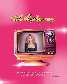
AI Influencers: When We Start Comparing Ourselves to Code
AI Influencers: When We Start Comparing Ourselves to Code
Remember when the internet was full of real people? Real faces, real stories, real influence. That era feels increasingly distant. Today, a growing number of “influencers” aren’t people at all — they’re AI-generated personas with immaculate skin, endlessly curated aesthetics, and perfectly on-brand personalities. And strangely, they’re gaining real followings.
From Meta’s AI chatbot profiles sliding into our DMs to entire Instagram accounts run by virtual models, we’ve entered a new era where algorithms don’t just shape the conversation — they are the conversation. The Dead Internet Theory, once a niche online conspiracy, is starting to feel like an uncomfortable mirror held up to our digital reality.
The Rise of the Synthetic Influencer
Take a scroll through Instagram or TikTok and you might stumble across an “influencer” with hundreds of thousands of followers. Their captions are polished, their outfits are flawless, and their engagement is enviable. But look a little closer and you’ll find that some of these accounts belong not to humans, but to CGI characters powered by generative AI and branding teams.
These digital figures never sleep, never age, and never post a bad angle. They can respond to DMs, collaborate with brands, and even “host” live events — all without a single human flaw. For marketers, they’re a dream: no scandals, no sick days, no negotiating fees. For audiences, they’re simultaneously fascinating and unnerving.
The Comparison Trap — Now with Extra Code
It’s one thing to compare ourselves to other people online — influencers with their highlight reels and filters. But what happens when we start comparing ourselves to machines?
AI influencers set a bar that isn’t just unrealistic — it’s impossible. Their bodies are rendered to perfection, their personalities are carefully scripted, and their lives are algorithmically optimised for engagement. Yet, human users — particularly younger audiences — may find themselves holding their own messy, unpredictable lives up against these digital ideals.
The pressure to “keep up” with someone who doesn’t exist is a whole new kind of psychological whiplash. And it raises the question: what happens to self-esteem, identity, and authenticity when the competition isn’t real?
An Internet Drifting from Reality
The Dead Internet Theory suggested that bots, AI content, and algorithms have hollowed out the internet, replacing human interaction with synthetic engagement. The emergence of AI influencers is that theory in high definition. We’re not just talking to chatbots anymore — we’re following, admiring, and even emulating them.
Social media, once sold as a place to connect, is slowly morphing into a stage where corporations puppeteer AI characters to hold our attention. The line between authentic and artificial is blurring — and disturbingly, many people either can’t tell the difference or don’t care to.
Where Do We Go From Here?
AI isn’t inherently the villain. Used responsibly, it can be a powerful creative tool. But when AI personas start to dominate the cultural space once occupied by real people, something fundamental shifts. The internet risks becoming less a mirror of human life and more a meticulously curated showroom — polished, profitable, and eerily empty.
Perhaps the better question now isn’t “Am I talking to someone or something?” but rather:
“Am I measuring myself against reality… or a simulation?”
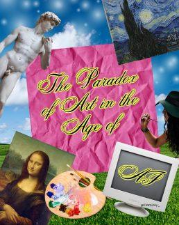
The Paradox of Art in the Age of AI
The Paradox of Art in the Age of AI
We live in a strange time for creativity.
Everywhere you look, there’s a growing desire for authenticity — for art made by humans, with imperfections, emotion, and intent. People are quick to say they prefer “real” art over AI-generated work. Yet, quietly, many of those same people are turning to AI tools because they’re faster, cheaper, and endlessly convenient.
It’s a contradiction that cuts deep for artists.
Everyone Wants Real Art — Until It Comes with a Price Tag
There’s no shortage of posts online declaring, “Support human artists!” or “AI art will never replace real creativity.” And it’s true — people are drawn to human expression. There’s something magnetic about seeing the world through someone else’s perspective, about knowing that a piece of work was shaped by thought, feeling, and lived experience.
But when budgets are tight, deadlines are short, or curiosity takes over, the temptation to type a few words into an AI generator and watch an image appear instantly can be too strong to resist.
It’s quick. It’s cheap. It’s “good enough.”
And that’s where the frustration begins. Artists aren’t just competing with each other anymore — they’re competing with algorithms.
The Quiet Cost of Convenience
AI art doesn’t appear from nowhere. These tools are trained on vast datasets filled with images made by real artists, often scraped from the internet without consent or credit. Their creative labour becomes invisible — absorbed into a machine that now produces infinite variations of their work.
So while AI might seem like a harmless creative shortcut, it quietly relies on the very human talent it threatens to replace.
For many artists, this feels like theft dressed up as innovation.
Why Human Art Still Matters
Despite the flood of AI content online, there’s something irreplaceable about human art.
You can sense when something’s been felt instead of generated.
Human art carries story, emotion, and intention. It reflects our flaws and contradictions — the very things that make us human in the first place.
A painting might not be “perfect,” but it holds a heartbeat.
A design might take longer to create, but it carries meaning that no machine can replicate.
In a digital world that’s becoming increasingly synthetic, people are starting to crave the real again — real people, real stories, real art.
Artists Deserve More Than Applause
But appreciation can’t stop at admiration.
If we want to keep human creativity alive, it has to be valued — in time, in credit, and in payment. Sharing a post that says “support artists” means nothing if we don’t actually do it.
The irony is that while AI art seems limitless, it’s the human touch that gives art its soul. And if we stop valuing that, we risk losing the very thing that makes art powerful — the connection between creator and viewer.
Reclaiming Creativity
AI can assist, inspire, and even open new creative doors — but it shouldn’t replace the artist behind the idea.
Now more than ever, supporting human creativity is an act of rebellion. It’s choosing emotion over efficiency. It’s choosing to see art not as a product, but as a piece of someone’s story.
Because no matter how advanced AI becomes, it will always be imitating something that only humans can truly create: meaning.
In an age of automation, choosing human art isn’t nostalgia — it’s preservation.

Whatever Happened to Tween Content?
Whatever Happened to Tween Content?
Once upon a time, tweens had their own universe.
There were Nickelodeon and Disney Channel stars — the IT boys and girls of the 2000s and early 2010s — who shaped everything from fashion to friendships. They were cool, but still relatable. Young enough to feel like your mate, yet old enough to look up to.
Fast forward to today, and that world has quietly vanished. The era of Hannah Montana, iCarly, and Victorious has been replaced by TikTok, YouTube and Instagram — platforms with no real “in-between” stage for growing up online.
And that raises a serious question: what happens to a generation with no dedicated space to just be tweens anymore?
From Tween Idols to Influencers
Disney Channel once served as a cultural middle ground — glossy but safe, aspirational but age-appropriate. Shows had morals (albeit cheesy ones), storylines about friendship, and characters who made mistakes without facing internet-sized consequences.
Now, that content gap has been filled by social media influencers — adults who are often selling lifestyles, products, and beauty standards rather than relatable experiences.
Instead of looking up to Selena Gomez in Wizards of Waverly Place, tweens are scrolling past twenty-somethings with full glam routines, curated aesthetics, and sponsorship deals. The line between inspiration and imitation has blurred, leaving many tweens trying to grow up too fast.
No Safe Space to Grow
Tween-focused TV used to act as a kind of buffer — a space where young audiences could experiment with identity, fashion, and friendship before stepping into the harsher realities of adolescence.
But TikTok, Instagram and YouTube collapse all those stages together. Ten-year-olds share digital spaces with adults. The content they consume — makeup tutorials, “Get Ready With Me” videos, and lifestyle vlogs — isn’t necessarily for them, but it’s what they see the most.
Without age-targeted media, the natural curiosity of tweens is being funnelled through platforms designed for engagement, not wellbeing. The result? Kids trying to look, act, and post like adults before they’ve had the chance to just be kids.
When Childhood Becomes Content
Tweens are incredibly impressionable, and the influencer world knows that.
From viral “clean girl” aesthetics to daily skincare routines featuring £50 serums, the messaging is subtle but powerful: appearance equals value.
It’s easy to see how that pressure builds.
Social media rewards visibility — the prettier, the older, the more polished you look, the more likes you get. The performance of adulthood has become a kind of social currency, even for those who haven’t reached their teens.
And while most influencers don’t set out to harm, the ecosystem itself doesn’t differentiate between a 12-year-old viewer and a 25-year-old one. It’s all just data, clicks, and conversions.
This creates a perfect storm — one where boundaries blur, algorithms overexpose, and predators inevitably take notice. (And yes, that’s a conversation that deserves more than a footnote, even if we only touch on it lightly here.)
The Cultural Consequences
Without a middle layer of media — that tween space where content is aspirational yet innocent — we’re losing an important stage of development. The jump from Bluey to TikTok is too big.
There’s no more gentle transition, no more silly sitcoms about school crushes or friendship dramas that end in a group hug. Instead, tweens are consuming content made for adults and trying to replicate it — from fashion trends to language to online personas.
It’s not about being prudish or nostalgic for the past; it’s about balance.
When every screen is a mirror reflecting adult ideals, how can children learn who they are outside of those influences?
Reimagining Tween Media for a Digital World
Maybe it’s time we rethink what tween content looks like in 2025.
The platforms have changed, but the need hasn’t. Tweens still want role models, stories, and spaces that speak to their stage of life — not ones that rush them through it.
Creators, brands, and media companies have an opportunity to build those spaces again — to make content that celebrates awkwardness, curiosity, creativity, and joy without pushing kids into premature adulthood.
Because right now, tweens aren’t growing up with Disney Channel.
They’re growing up with TikTok — and that’s a completely different kind of storytelling.
The question isn’t just “what happened to tween content?”
It’s whether we’re willing to rebuild it — before a whole generation forgets what it’s like to just be a kid.
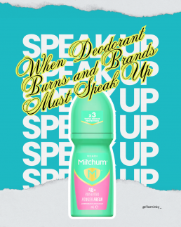
When Deodorant Burns and Brands Must Speak Up
When Deodorant Burns and Brands Must Speak Up
It’s rarely glamorous when a trusted product turns problematic. For many of us, deodorant is simply a reliable daily ritual—spray or roll-on in the morning, worry less about odour or sweat for the day. So when reports emerged that Mitchum’s 48-hour roll-on antiperspirant was causing burning underarms, irritation, rashes and worse, it struck a nerve. People.com+2ITVX+2
What happened?
Mitchum issued an apology after a large number of consumers in the UK, Ireland and South Africa reported severe reactions—including red, blistering underarms, stinging, and what some described as “chemical burns”. People.com
The company’s response: the formula itself hadn’t changed, but a change in the manufacturing process of a raw material caused some batches to interact with skin differently. They’ve reverted to the original process and are withdrawing affected batches. ITVX+1
Brand impact: trust meets trauma
For a brand like Mitchum, once known for strong antiperspirant performance, this kind of incident does several things at once:
- Erosion of reliability: When a product you’ve used for years suddenly fails you—or worse, injures you—the implicit trust breaks.
- Emotional fallout: Some users reported pain, sleepless nights, even scarring. These aren’t mild product complaints, they’re health & wellbeing issues. The Independent
- Reputational risk: Social media (especially TikTok) amplified individual stories, turning niche complaints into widely seen alerts. Mitchum’s delay in addressing the issue left a vacuum where frustration grew. People.com
- Credibility gap: The phrase “temporary irritation” used in the brand’s statement was criticised as downplaying severity. Wanting to reassure is one thing; seeming to minimise pain is another. People.com+1
Should brands speak out when things go wrong?
Yes—and they must. But how they speak matters just as much as that they do.
Why speaking out is necessary:
- Transparency builds trust. Acknowledging fault or potential fault avoids the sense of cover-up.
- It’s a moral imperative. If consumers may be harmed, the brand has a duty of care.
- It prevents reputational escalation. Waiting while complaints mount gives power to social outrage rather than brand narrative.
But speaking out poorly can backfire:
- Vague language (e.g., “temporary irritation”) can be perceived as dismissive.
- Half-measures (e.g., “voluntary removal” rather than full recall) may be seen as cost-driven rather than consumer-driven.
- Delay is costly. The longer a brand stalls, the more stories proliferate unchallenged.
- Over-focus on process (e.g., “we changed manufacturing”) without empathy for the affected lacks emotional resonance.
What Mitchum should (and partly has) done
- Full public clarity: Which batches are affected, what consumers should do, how the brand is compensating. They did publish codes for affected batches. The Independent
- Offer support: Direct channels for complaints, medical advice referrals, refunds or replacements.
- Undertake remediation: Fix the manufacturing process, reassure customers, then communicate the fix. Mitchum states they have reverted the process. ITVX
- Use brand values: Acknowledge the deviation, reaffirm that quality and safety are core values—and show how they will prevent recurrence.
- Follow-up communication: Don’t just issue one apology and vanish. Provide updates, transparent monitoring, and showcase prevention measures.
What it means for consumers
For anyone using antiperspirants or deodorants:
- Check batch numbers and product codes if you hear of issues.
- Watch for skin sensitivity signs: redness, stinging, blisters. These may be more than simple irritation. Verywell Health
- When you feel uneasy about a trusted product changing subtly (smell, texture, effect), trust your gut.
- Understand that large brands may not always publicise manufacturing changes or minor formula tweaks—but your skin might notice.
The bigger picture: brand accountability in personal care
This incident with Mitchum is part of a broader trend: personal-care brands must balance innovation (new scents, new packaging, manufacturing efficiencies) with safety, clarity and consumer trust. As consumers become more informed—and empowered through social media—brands that hide behind opaque statements or delay responses risk far more than lost sales; they risk becoming irrelevant or distrusted.
In conclusion
When your underarm deodorant leaves your skin burning, it isn’t just a bad day—it’s a breach of trust. And when a brand doesn’t act swiftly, clearly, and empathetically, that breach deepens.
For Mitchum, the path back isn’t just reverting a manufacturing tweak—it’s rebuilding how they speak, how they listen and how they protect the people who rely on their products.
For us consumers, incidents like this are a reminder that even everyday products deserve scrutiny—and that our comfort, safety and trust are not too small to matter.

The Labubu Craze: Same Hype, New Generation
The Labubu Craze
Same Hype, New Generation
The Labubu Craze: Same Hype, New Generation
If you’ve spent any time online recently — especially on TikTok or collector forums — you’ve probably seen them: wide-eyed, pointy-eared creatures called Labubu.
They’re not plush toys, not quite action figures, but something in between — a mix of art, collectable and cultural obsession. And they’re taking the internet by storm.
But before Labubu fever, there were Cabbage Patch Dolls. There were Beanie Babies. There were queues outside toy shops, bidding wars, limited editions, and moral panics about parents fighting in aisles for the “must-have” toy of the year.
In other words, the Labubu craze isn’t new — it’s history repeating itself, just with a modern algorithmic twist.
So, what exactly is Labubu?
Labubu is a mischievous little character from The Monsters series by Hong Kong-based artist Kasing Lung, produced by collectible brand Pop Mart.
Each figure is sold in a “blind box” — meaning you don’t know which design you’re getting until you open it. The thrill of mystery, the hunt for rare editions, and the community trading aspect have all fuelled its cult following.
They’re adorable, slightly unsettling, and highly collectible. Some fans call them “designer toys”, others “emotional investments”. Either way, they’ve become a symbol of 2020s consumer culture: art meets commerce, with a dash of nostalgia and a hit of dopamine.
The echoes of past crazes
Labubu isn’t the first creature to spark chaos. Every generation has its “must-have collectible” moment.
- Cabbage Patch Dolls (1980s): Handmade-style baby dolls that sparked actual riots in toy shops. Parents fought over them like concert tickets.
- Beanie Babies (1990s): Soft toys turned speculative assets — people genuinely believed they’d fund future mortgages.
- Tamagotchis (late ’90s): Digital pets that needed constant care — or they’d “die”. Schools banned them.
- Funko Pops (2010s): Vinyl figurines that turned fandom into a shelf-based lifestyle.
Each of these crazes combined two things: emotion and scarcity. And that’s exactly what Pop Mart and Labubu have mastered — only this time, they’ve wrapped it up in sleek branding and influencer-driven hype.
The psychology behind the obsession
The modern twist is how social media has amplified the cycle.
Back in the ’90s, you had to go to a toy shop or read a magazine to find out what was trending. Now, one unboxing video on TikTok can spark global demand overnight.
The formula works perfectly:
- Limited availability → instant FOMO.
- Mystery box → dopamine reward system.
- Online community → validation loop.
It’s the collector’s high — designed for the digital age.
And in a world where people are burnt out, nostalgic, and craving simple joys, it’s easy to see why adults are as hooked as kids once were.
Collecting as comfort
Maybe that’s the real story behind Labubu’s success. It’s not just about owning something cute or rare — it’s about control.
Collecting provides structure, escapism, and nostalgia. It’s a harmless obsession that gives people something to look forward to, trade, display, and connect over.
Labubu’s charm lies in its weirdness — it’s not perfectly polished, and that’s the point. In a world of AI-generated perfection and digital clones, something handmade-feeling and tactile feels refreshing.
So while it’s easy to dismiss these little monsters as just another fad, they might actually say something deeper about our cultural mood.
Same hype, new tools
From Cabbage Patch to Beanie Babies to Labubu — the core is the same: connection, emotion, identity.
What’s changed is how quickly hype spreads and how global it’s become.
Pop Mart isn’t just selling toys — it’s selling belonging. And in a hyper-digital world, that might be the most valuable commodity of all.
Every generation has its craze. Labubu just happens to be ours — cute, chaotic, and perfectly built for the algorithm.