From Pantone’s Colour of the Year to the Ugliest Colour in the World
Every December, designers, trend forecasters and brand strategists hold their collective breath waiting for one announcement: the Pantone Colour of the Year.
It’s a tradition that shapes fashion collections, marketing palettes and Instagram feeds for months. The colour isn’t just a shade, it’s a statement about mood, emotion, and culture.
Pantone calls it “a snapshot of what we see taking place in our global culture.”
But while we celebrate colour as art and emotion, there’s another, far darker side to colour psychology, one that’s used not to attract, but to repel.
Colour That Inspires — and Colour That Discourages
Each year, Pantone tells us what’s in.
From Viva Magenta to Classic Blue and Peach Fuzz, these shades are chosen for how they make us feel: hopeful, energetic, calm, connected.
But what about colours chosen specifically to make us feel the opposite, disgust, discomfort, even shame?
That’s where the infamous “world’s ugliest colour” comes in.
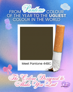
Meet Pantone 448C: The Colour Designed to Make You Quit
Back in 2012, the Australian government commissioned a study to find a colour that would make cigarette packaging as unattractive as possible. After testing dozens of shades with focus groups, they found a clear winner, or rather, loser.
Pantone 448C, a murky brown-green-grey, was officially declared the world’s ugliest colour.
Psychologists described it as “dirty”, “deathly”, and “tar-like”. Focus groups associated it with decay, filth, and sickness.
It was so repulsive that it became the standard colour for plain cigarette packaging, deliberately chosen to make smoking feel less glamorous and more grim.
And it worked.
Australia saw a noticeable decline in smoking rates after the packaging change, and several countries, including the UK, France and New Zealand, followed suit.
A single colour had changed behaviour.
The Psychology Behind the Palette
We often think of colour as aesthetic — a creative choice. But colour is psychological before it’s visual. It speaks to our instincts.
- Warm colours (reds, oranges) evoke passion, energy and appetite.
- Cool tones (blues, greens) feel calm, clean, trustworthy.
- Muted tones — especially browns and greys — can feel lifeless or institutional.
That’s why Pantone 448C was so effective: it stripped away the allure. It took something once designed to feel sleek and desirable, and rebranded it as something repulsive.
It’s a clever inversion of what brands normally do — colour not to attract, but to discourage.
Colour as Communication
The contrast between Pantone’s joyful Colour of the Year campaigns and the government’s anti-smoking palette highlights something fascinating: colour can carry meaning without words.
Pantone uses colour to express emotion, to unify global design under shared optimism.
Governments use colour to influence public behaviour and perception.
Both rely on the same truth, colour speaks directly to the subconscious.
Designers already know this intuitively: a good colour choice can sell a product, shift a mood, or define a brand. But the “ugliest colour in the world” reminds us that design can also serve a social purpose, that sometimes, beauty isn’t the goal.
Beauty, Behaviour, and Branding
There’s a poetic irony in how colour theory bridges design and psychology.
While brands chase Pantone trends to appear relevant or aspirational, governments use the very same science to save lives.
It shows that colour isn’t neutral; it carries cultural, emotional, and even ethical weight.
What’s “beautiful” in one context might be “disgusting” in another, depending entirely on what we’re trying to achieve.
Maybe that’s the real lesson behind Pantone’s yearly ritual: it’s not just about the colour we celebrate, but how we understand the power of colour itself.
From inspiring art to discouraging addiction, colour design sits quietly at the crossroads of creativity and psychology — shaping how we feel, and sometimes, how we behave.